ALPHA ALTITUDE
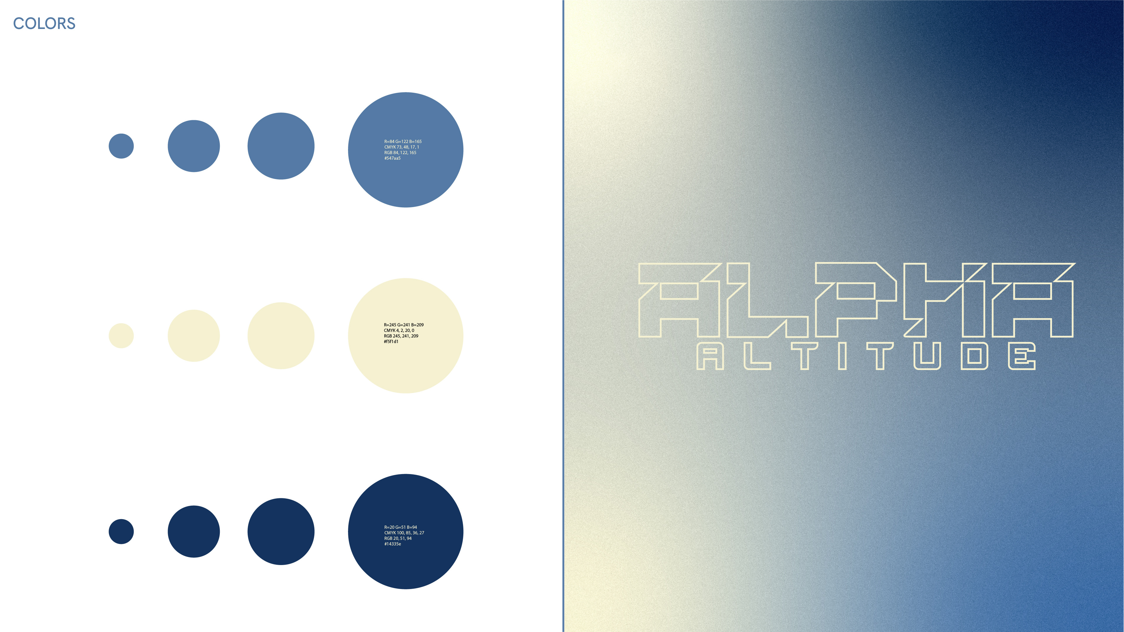
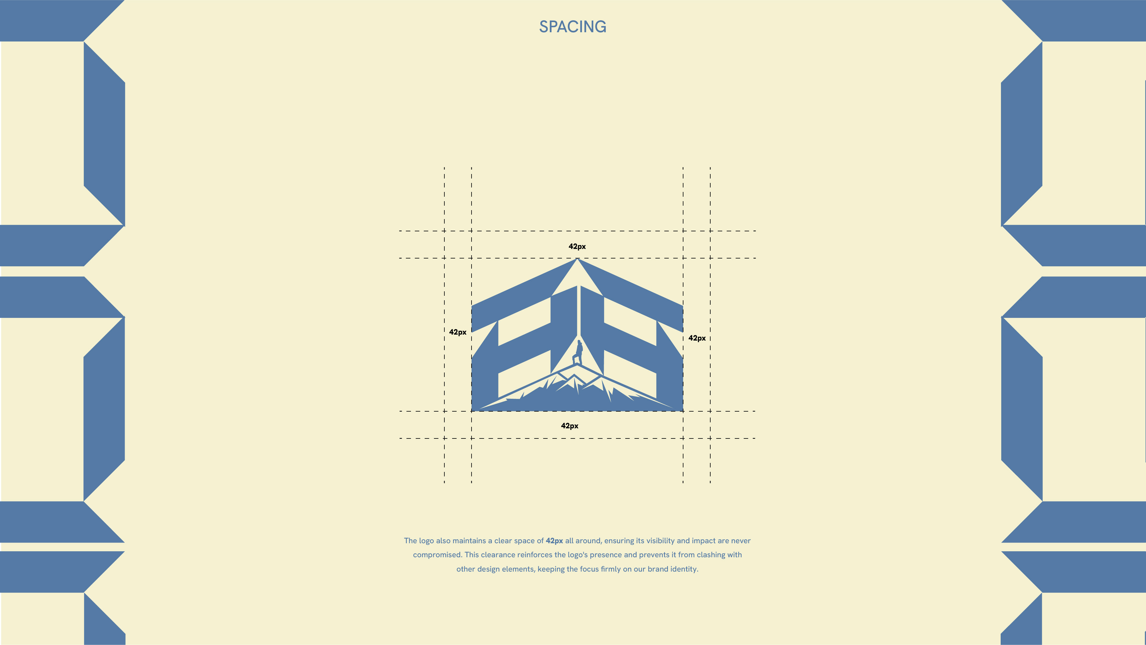
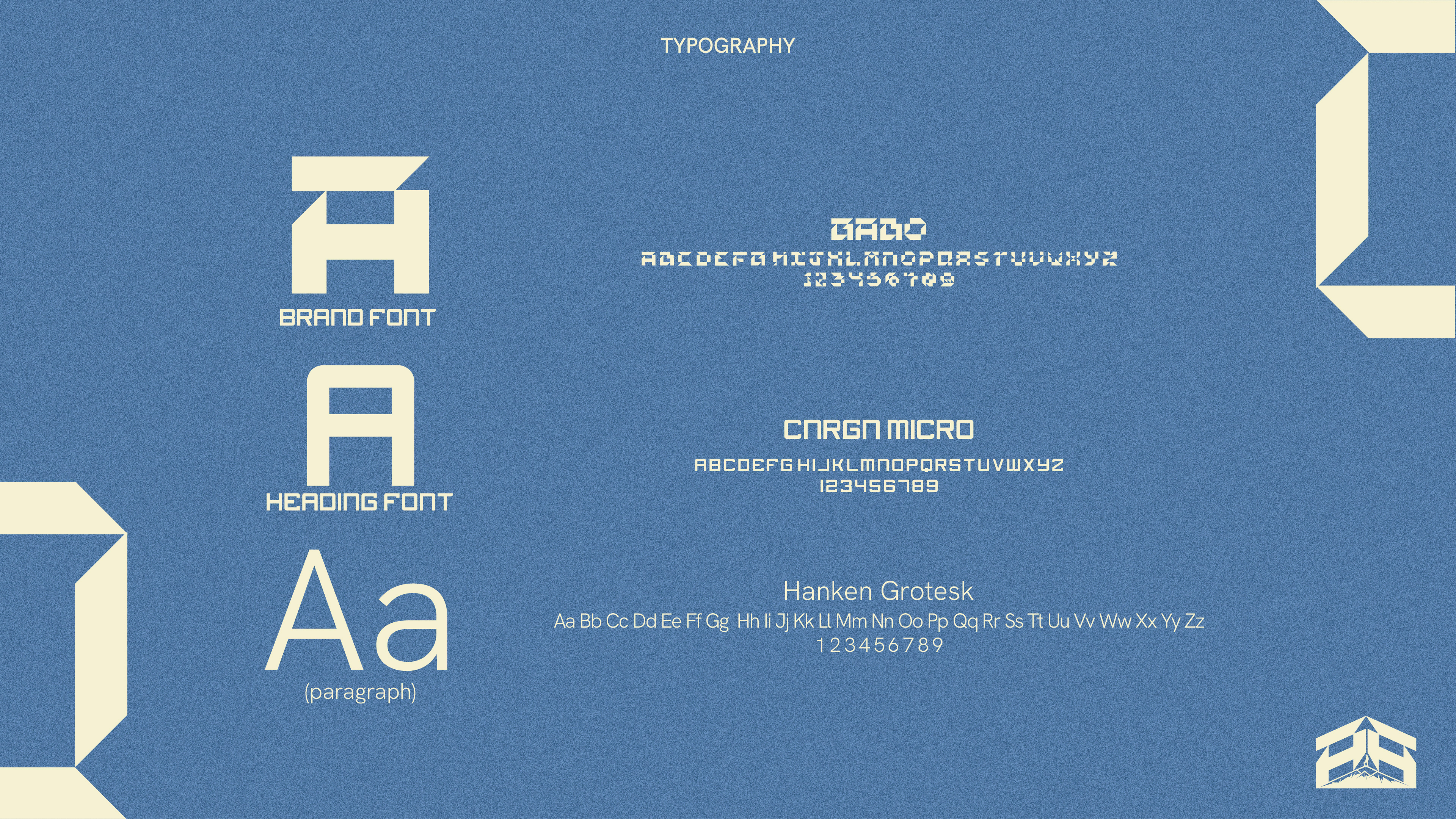
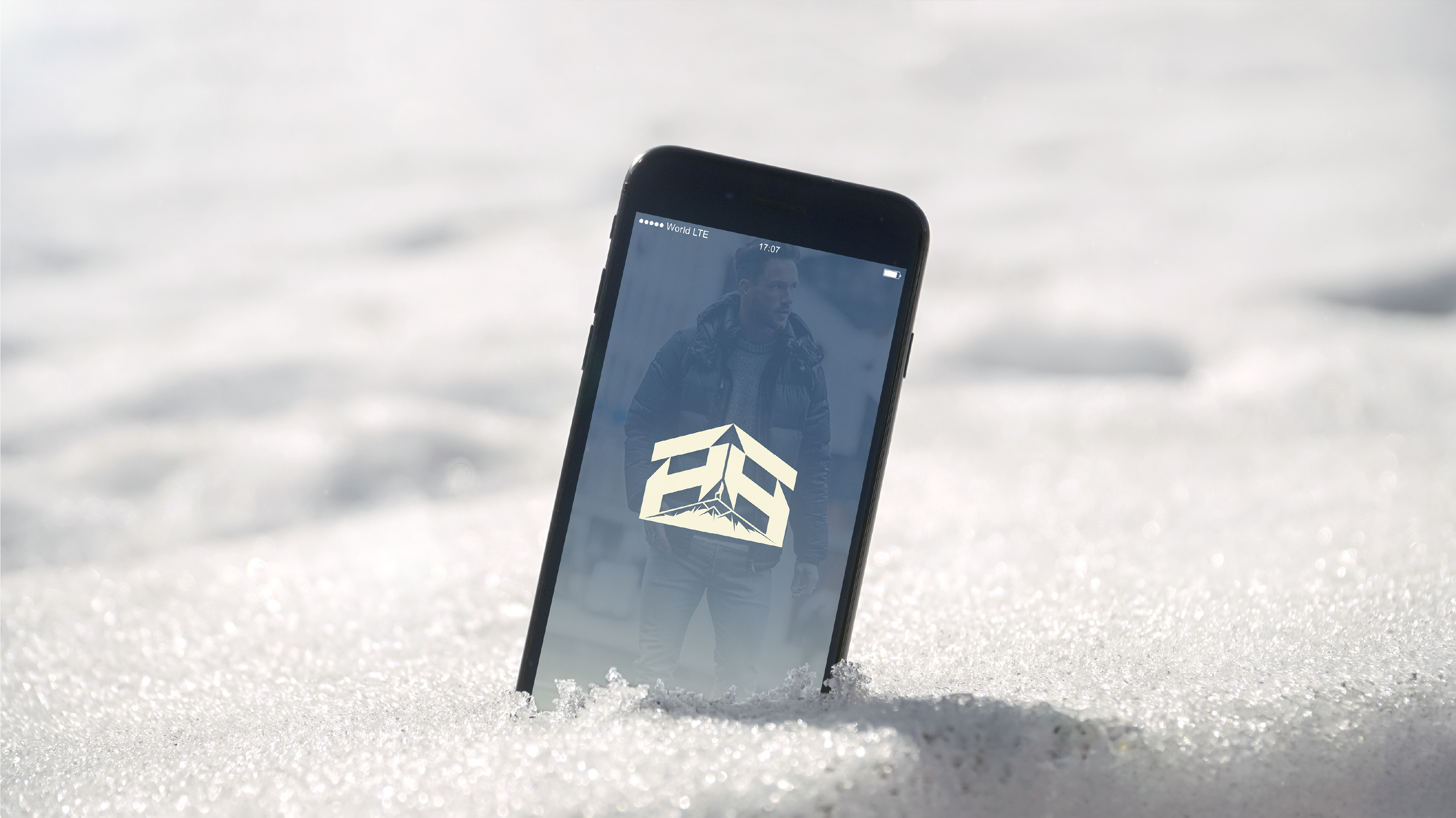
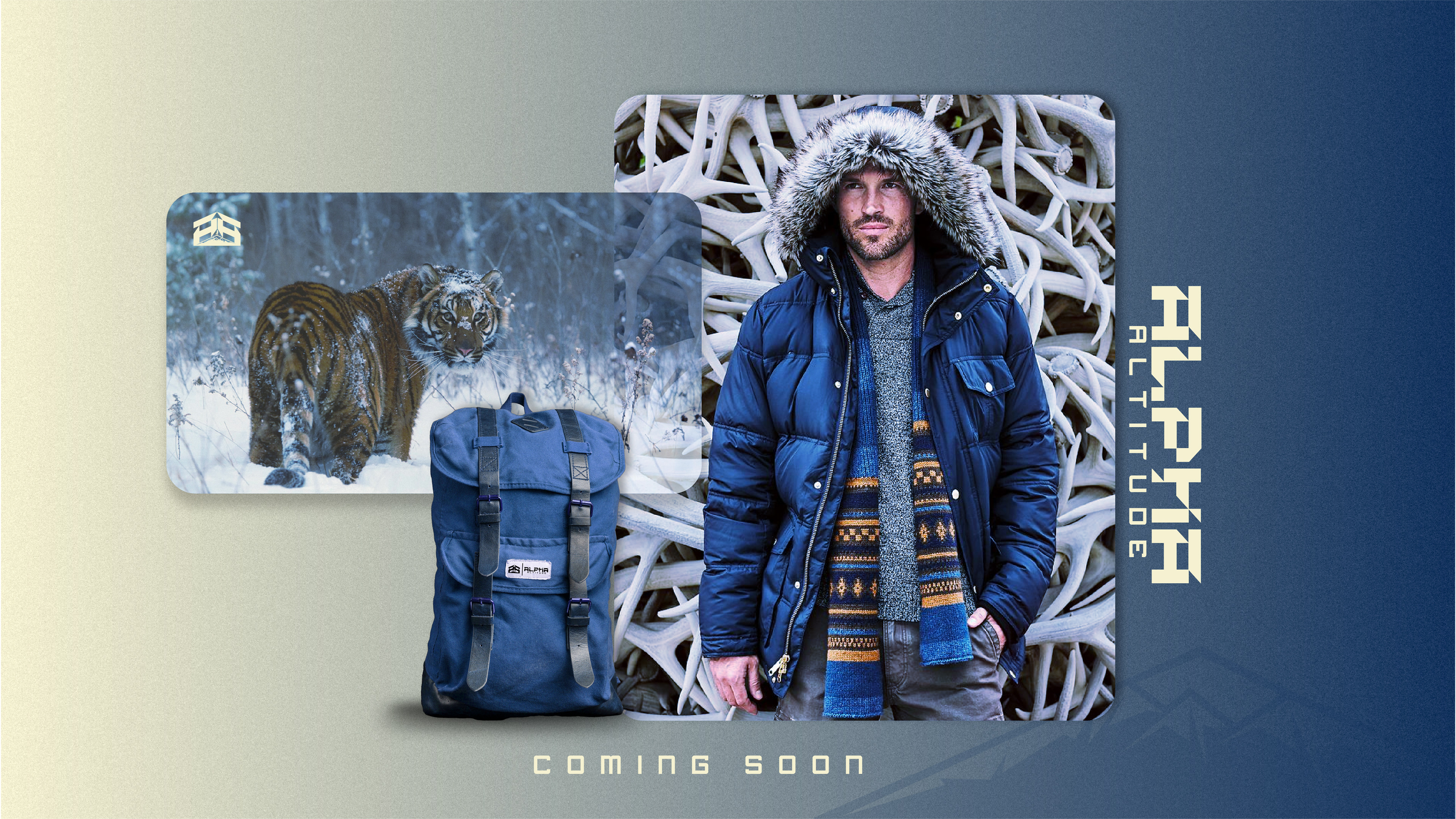
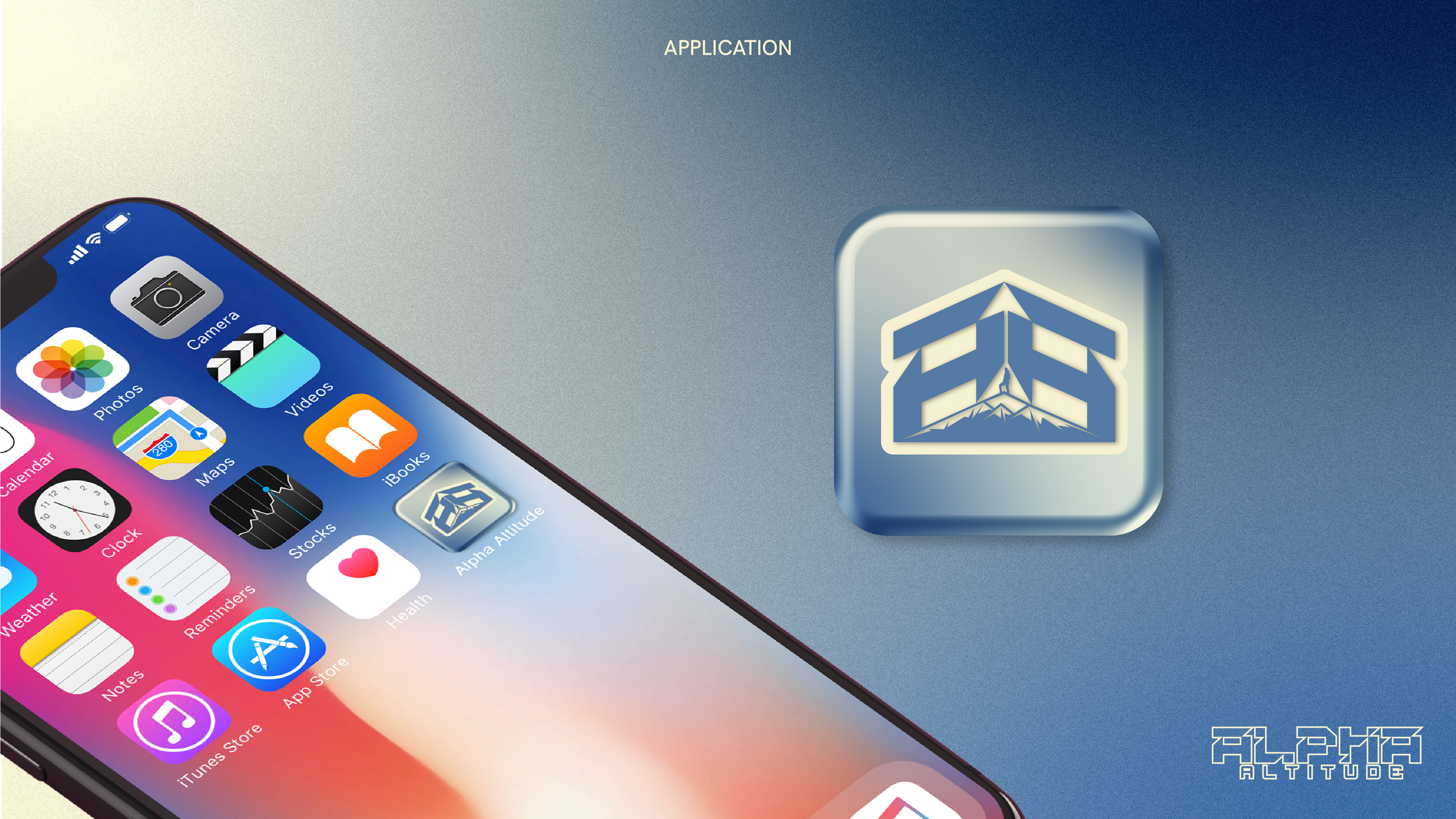
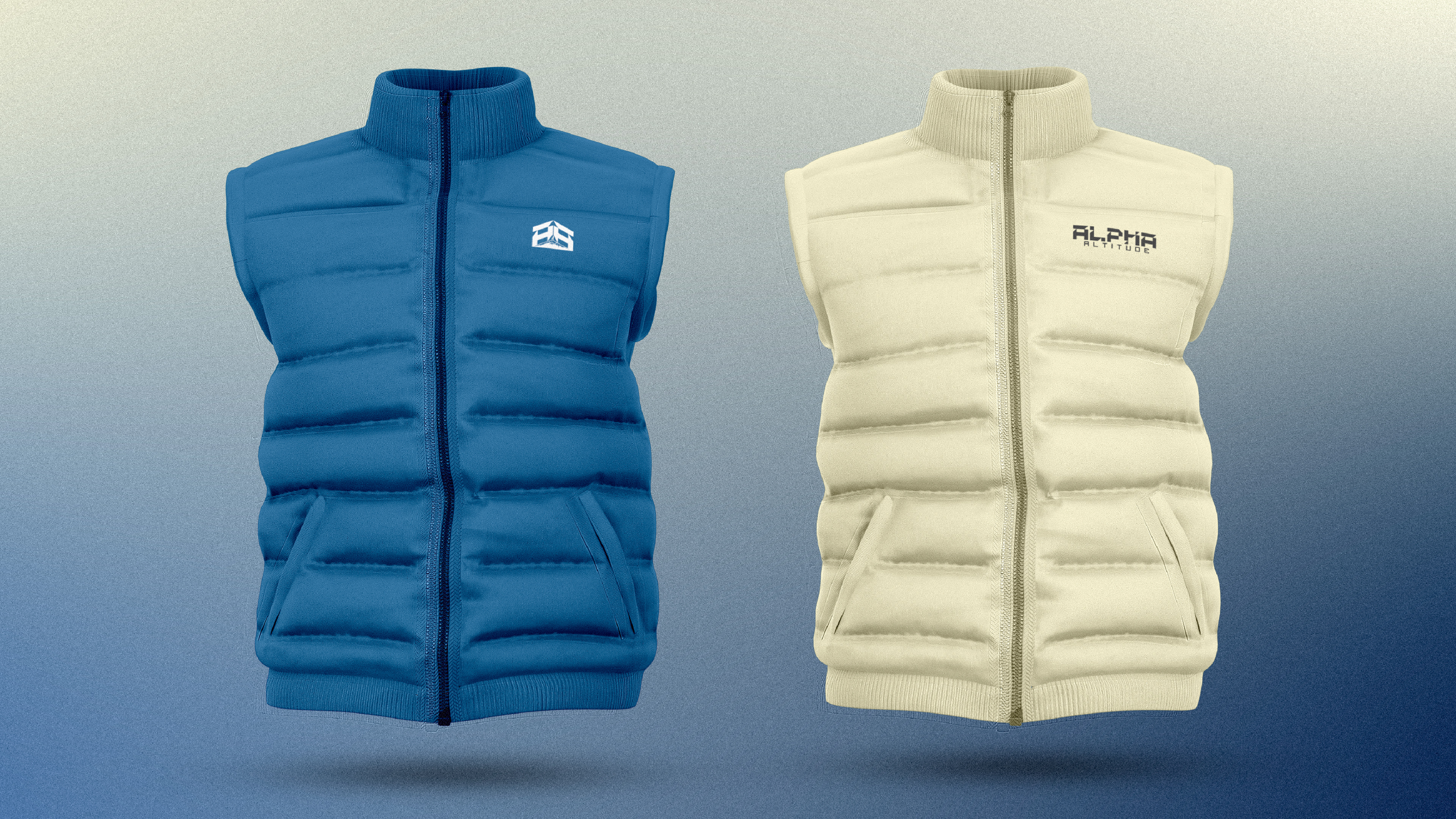
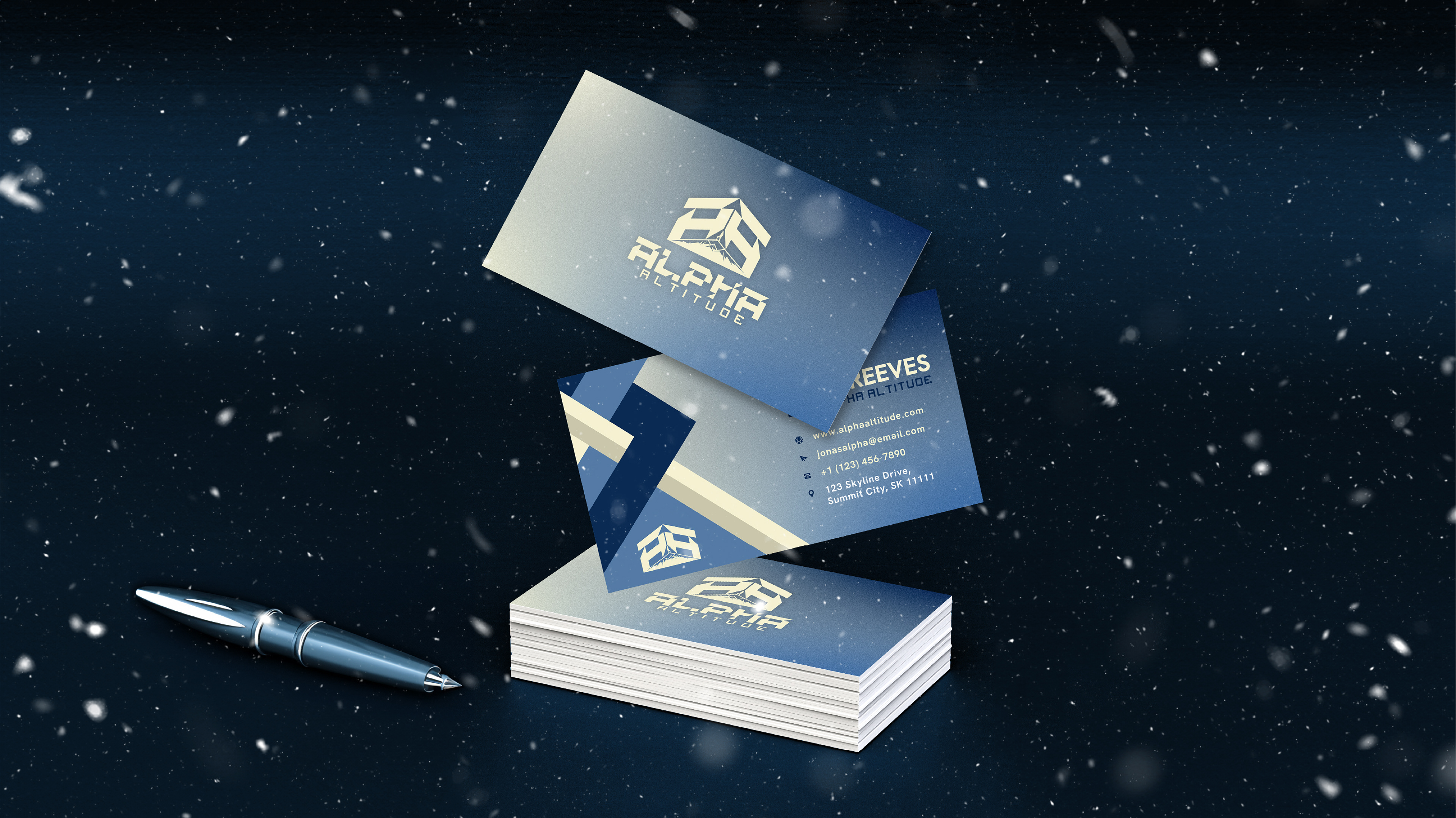
For the Alpha Altitude logo, I designed a mountain formed by two 'A's to symbolize challenges and achievements, reflecting the brand's adventurous spirit. The color palette features blues for skies and waters, and creams for earthy trails, paired with a modern, legible font suitable for diverse applications. The logo is optimized for visibility across digital platforms and print materials, ensuring it's recognizable in various sizes. Careful placement on apparel ensures the logo is visible yet unobtrusive, enhancing the gear without overwhelming it. Marketing materials focus on visual storytelling, setting adventurous scenes that align with the brand's ethos. Stationery designs prioritize usability and brand presence, with a clean layout and prominent logo placement to maintain a professional appearance and reinforce brand identity.
TROY EVANS FITNESS
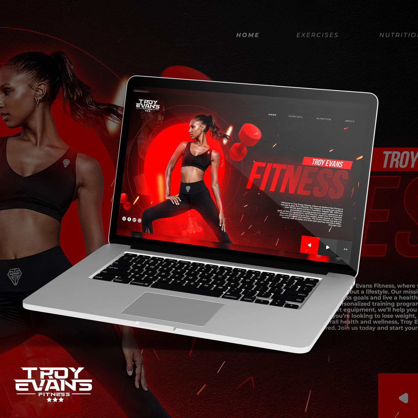
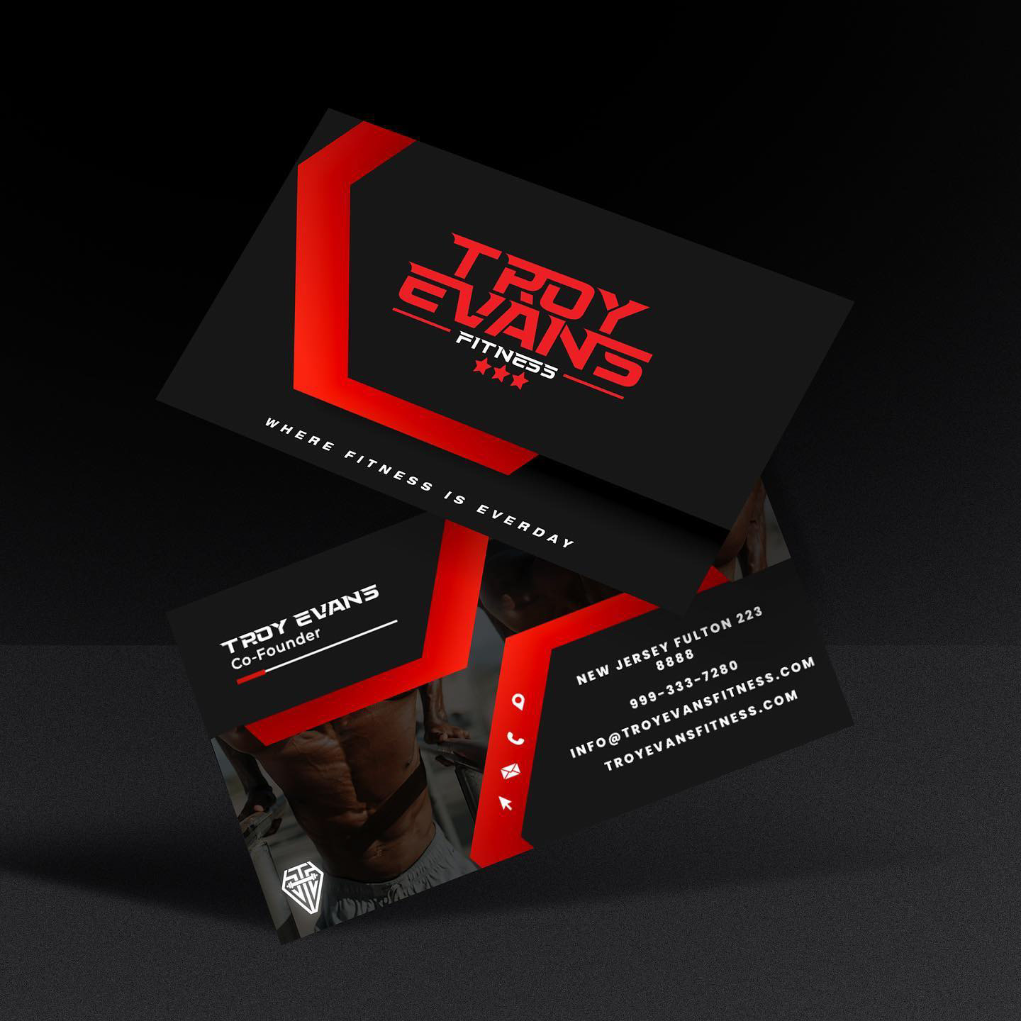
Troy Evans Fitness is a dynamic brand aimed at athletes and fitness enthusiasts, offering premium quality apparel designed to enhance performance and embody dedication. The primary logo features a bold, modern typeface with a weightlifting bar, using vibrant red, black, and white colors to symbolize energy, power, and balance. The tagline, “Embrace the Grind. Own the Look,” reflects the brand’s philosophy of hard work and style. Supporting messages emphasize peak performance, quality, and comfort. Visual elements include a hexagonal pattern and powerful imagery of athletes. The brand identity extends across apparel, a sleek website, and marketing materials, ensuring a cohesive and professional look that appeals to those striving to achieve their best.
DAVIS & ROBSON REAL ESTATE
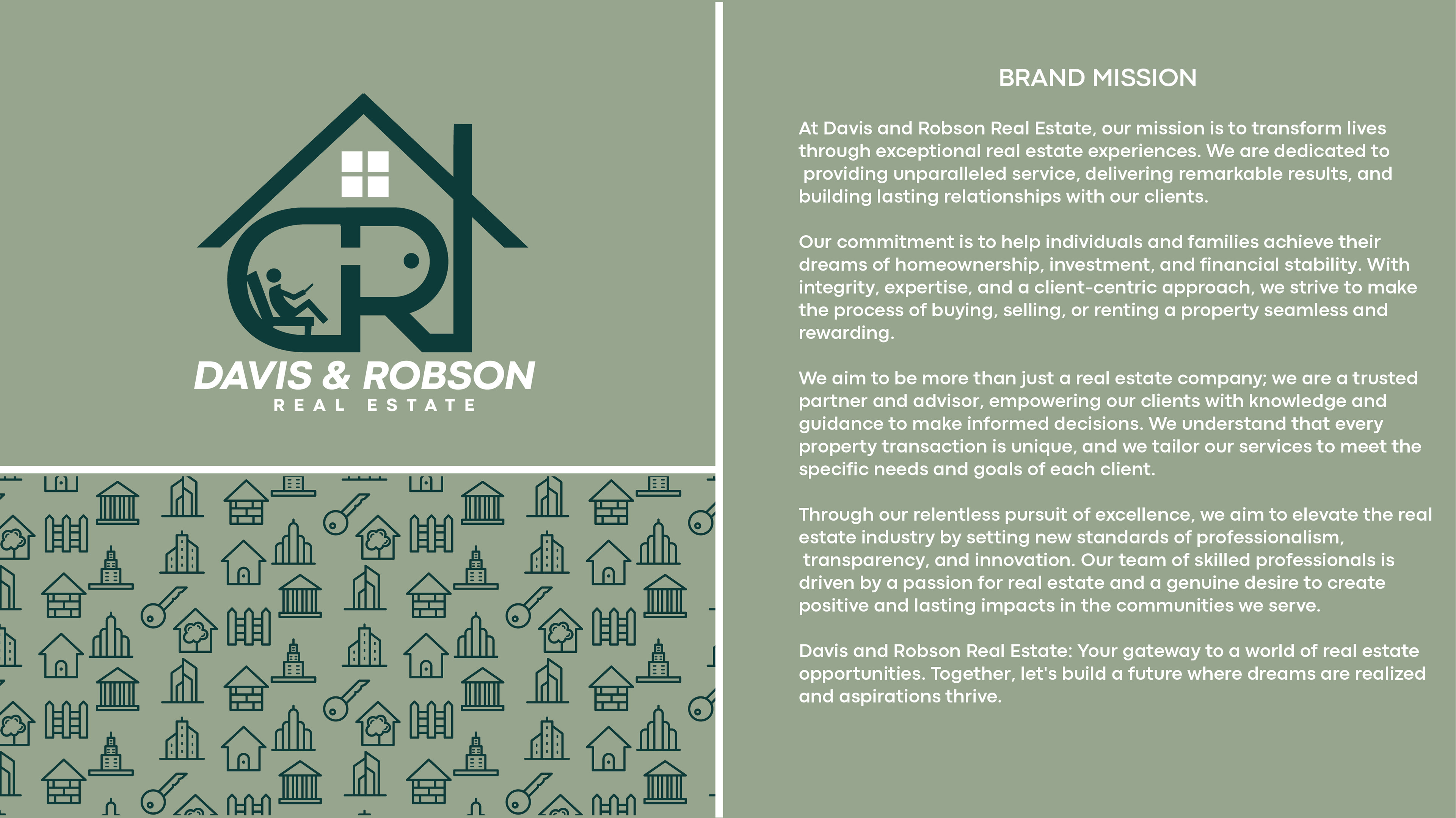
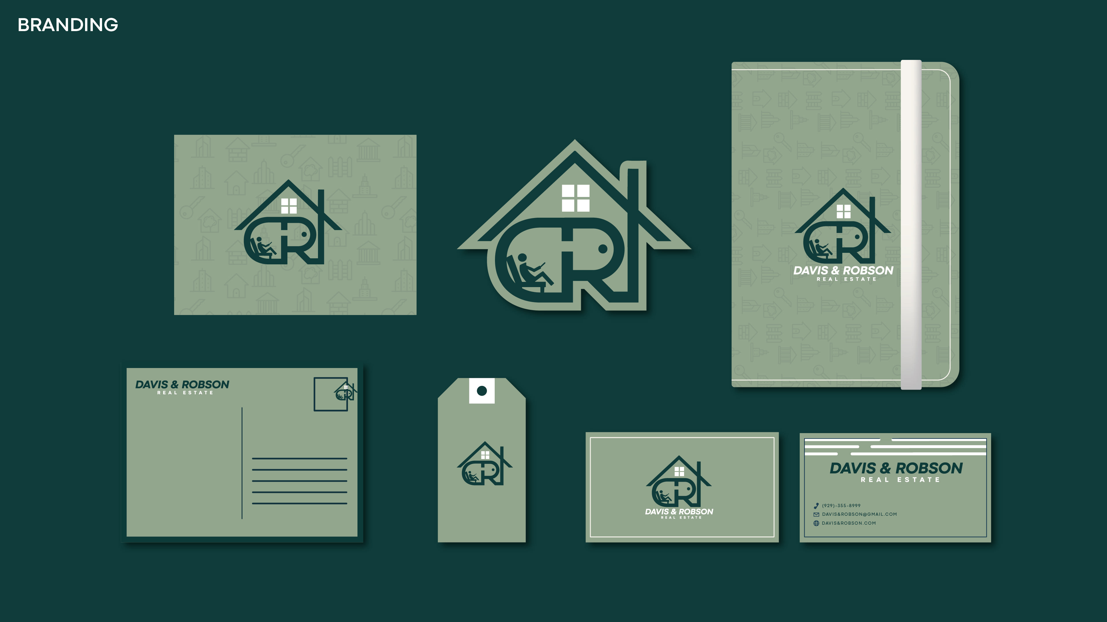
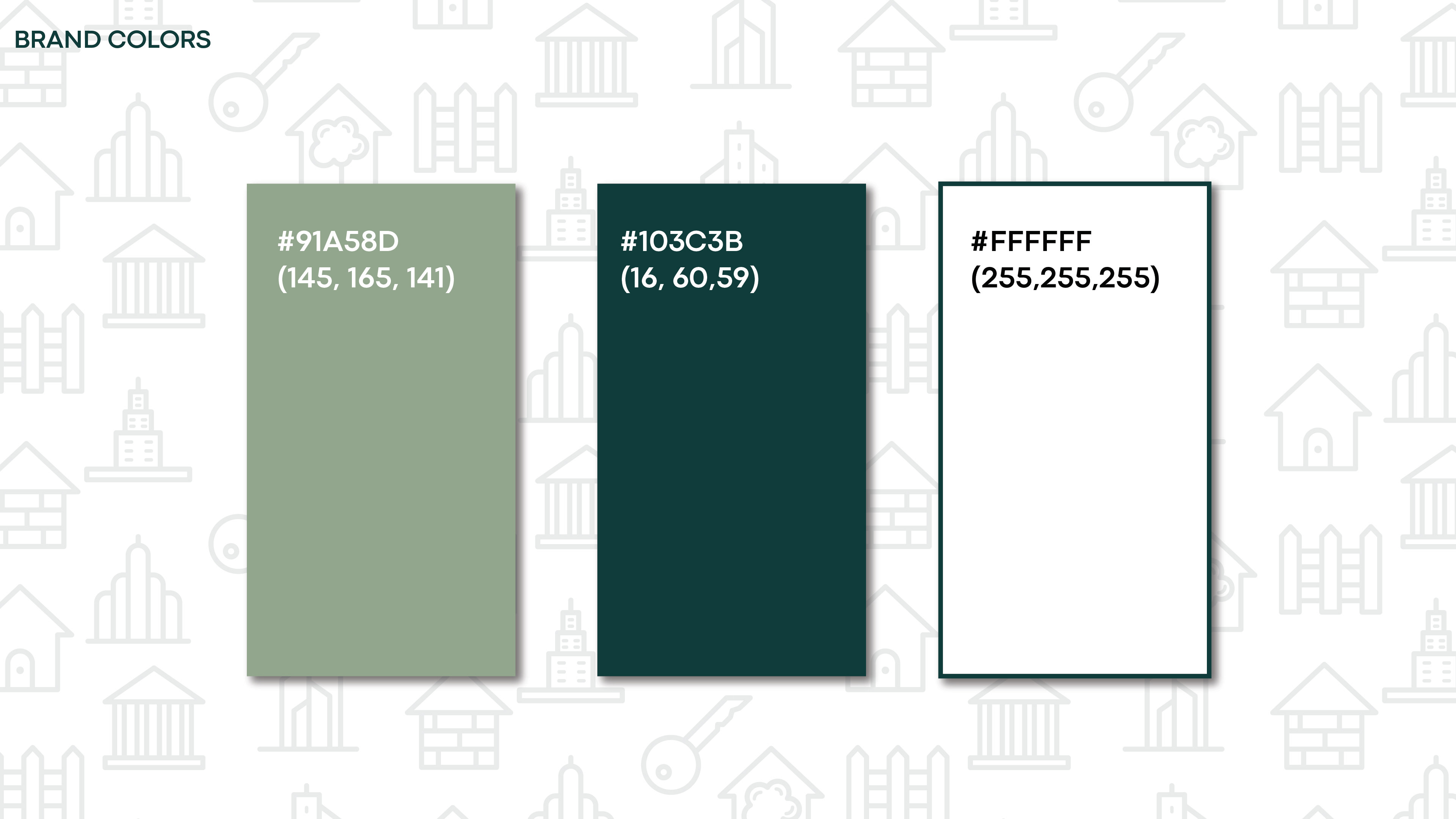
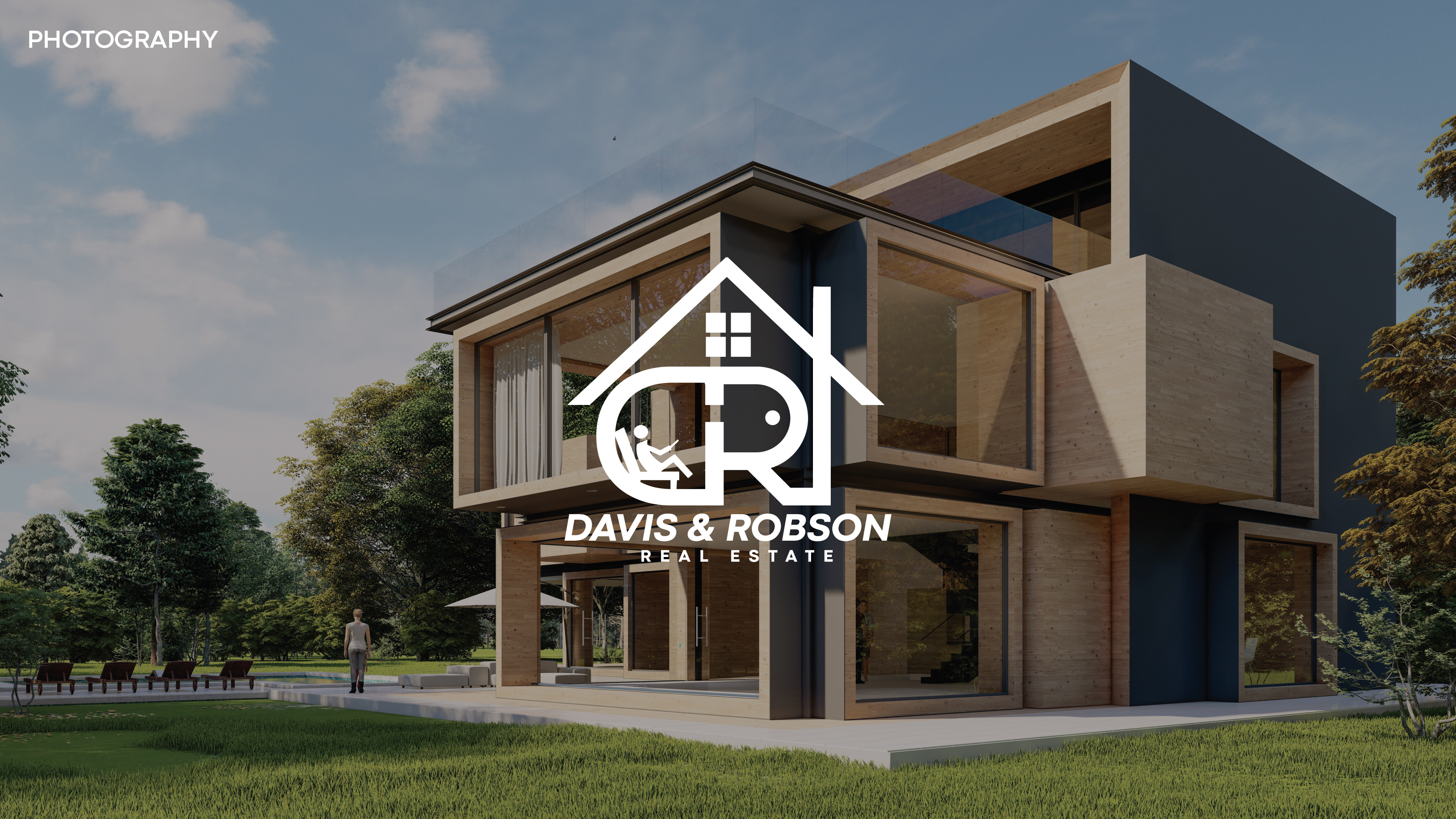
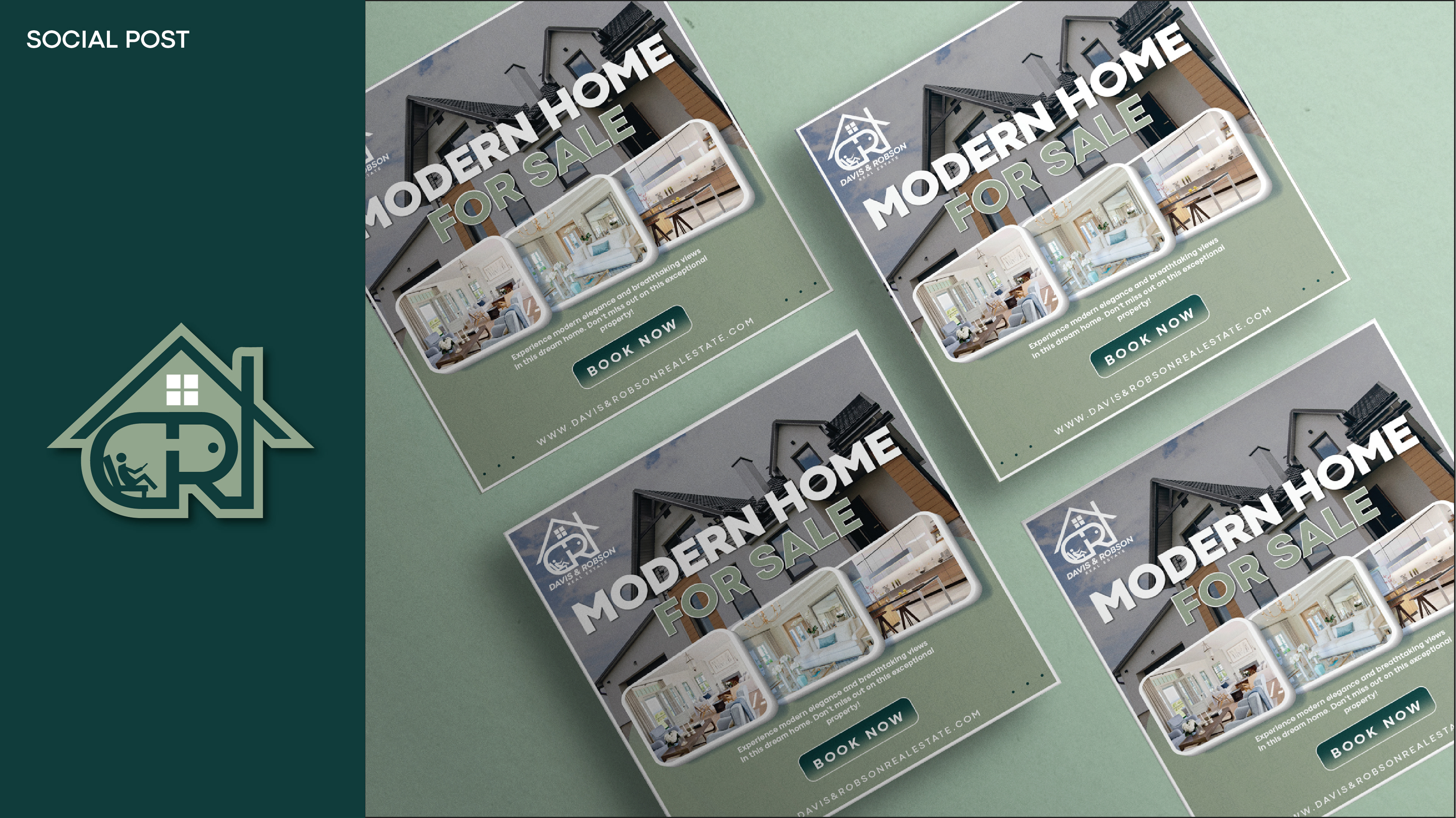
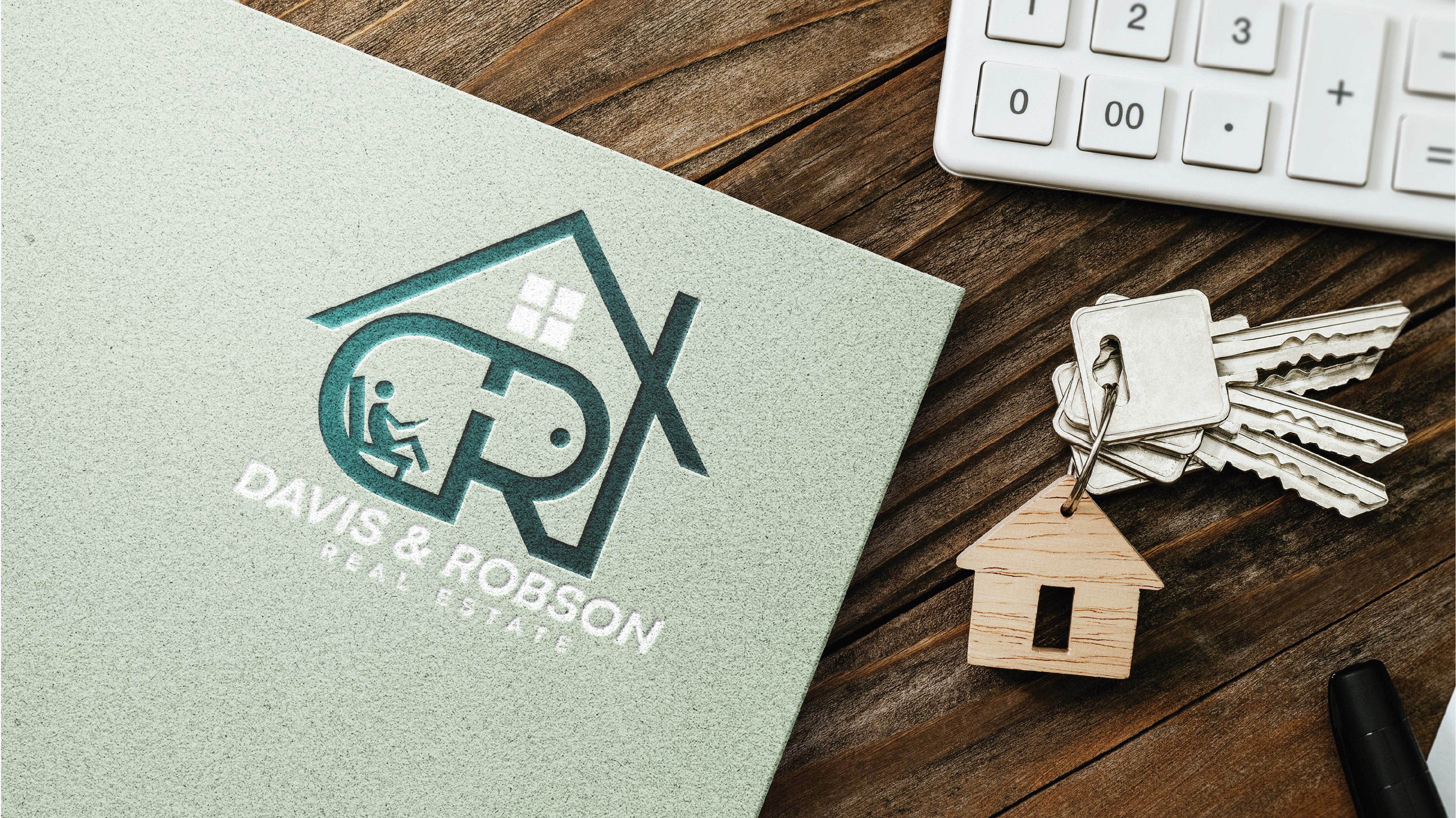
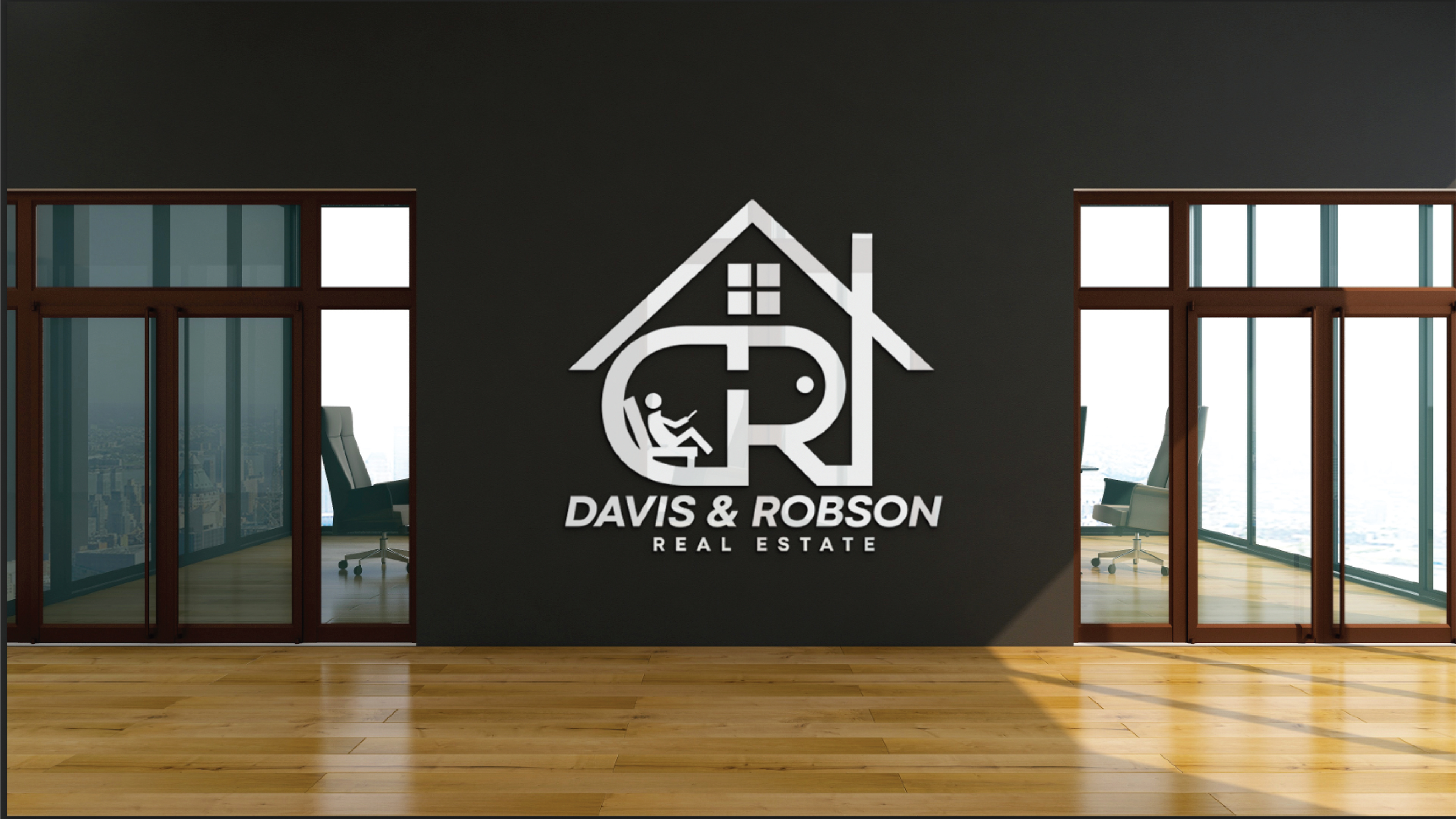

The branding for Davis & Robson Real Estate features a clean, sophisticated design with a logo that integrates the initials "D" and "R" into a house shape, symbolizing direct ties to home ownership and real estate services. The color palette of deep forest green and muted sage evokes growth, prosperity, and a welcoming atmosphere, ensuring readability across various media. The logo is versatile in color and monochrome, maintaining consistency across digital and print materials. Background patterns of buildings and keys highlight the firm’s real estate focus, enhancing the brand's comprehensive property services. This strategy extends to office décor and staff uniforms, creating a unified brand presence that reflects the firm's values and professionalism both online and in person.
COMMUNITY LINK
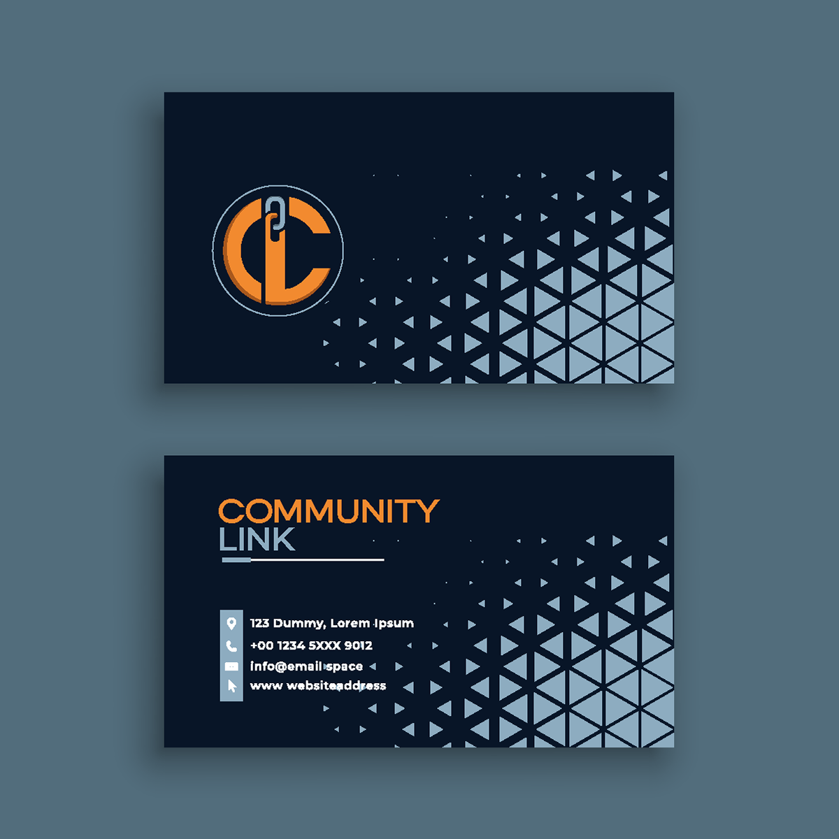
I designed the Community Link logo to represent community cohesion, featuring a large 'C' shaped like a chain, using dark blue for trust and bright orange for energy. This logo appears on everyday items like shirts, notebooks, and water bottles, reinforcing community connection constantly. Online, the branding is fun and friendly, with vibrant colors and the logo on social media posts to foster a sense of belonging. Easy-to-read flyers and booklets encourage community involvement, highlighting the benefits of mutual support. Public displays of the logo in signs and posters emphasize unity and shared values. Overall, the branding ensures Community Link’s message of connectivity is visible everywhere, from apparel to digital platforms.
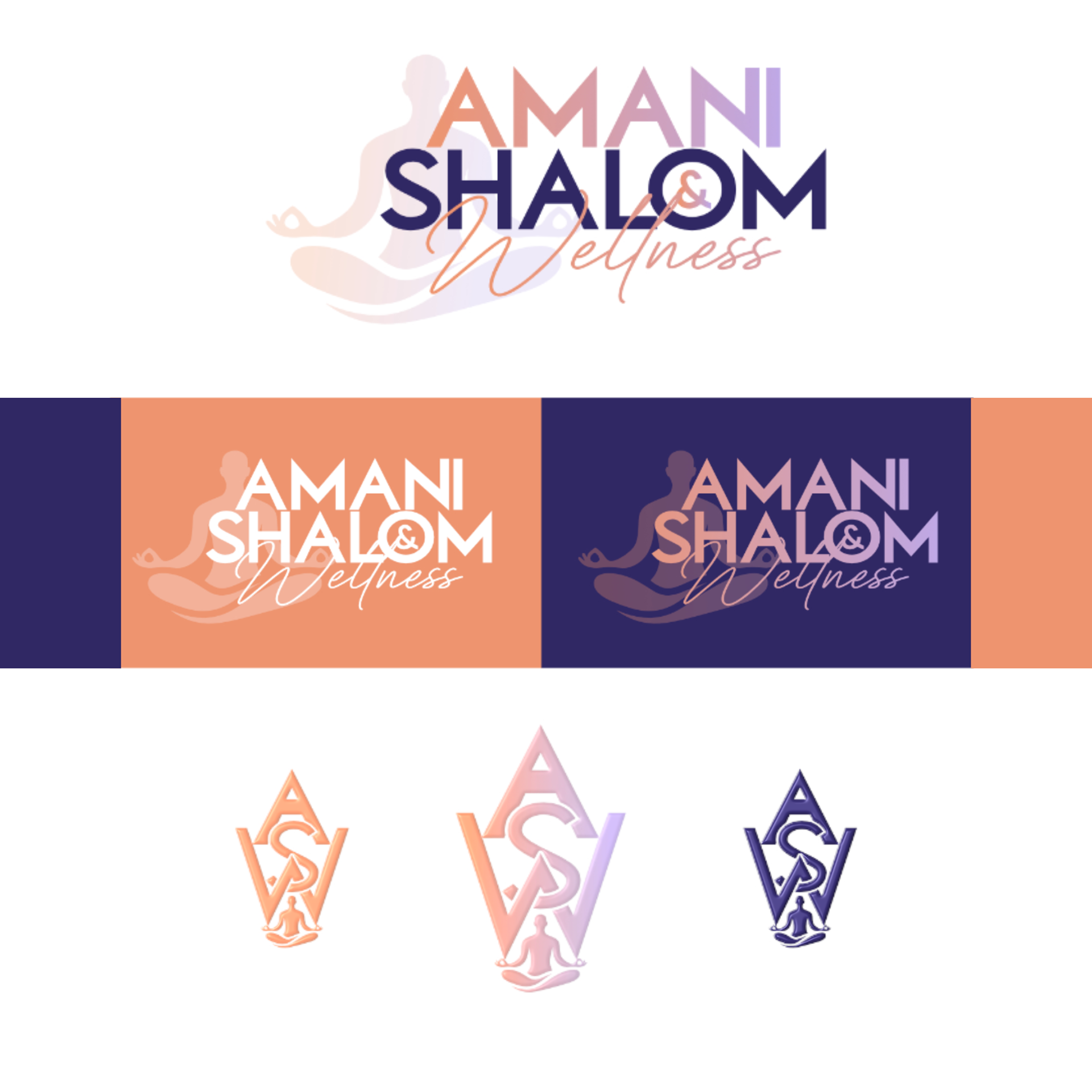
AMANI & SHALOM WELLNESS

NORTH MID ATLANTIC SPORTS MEDIA
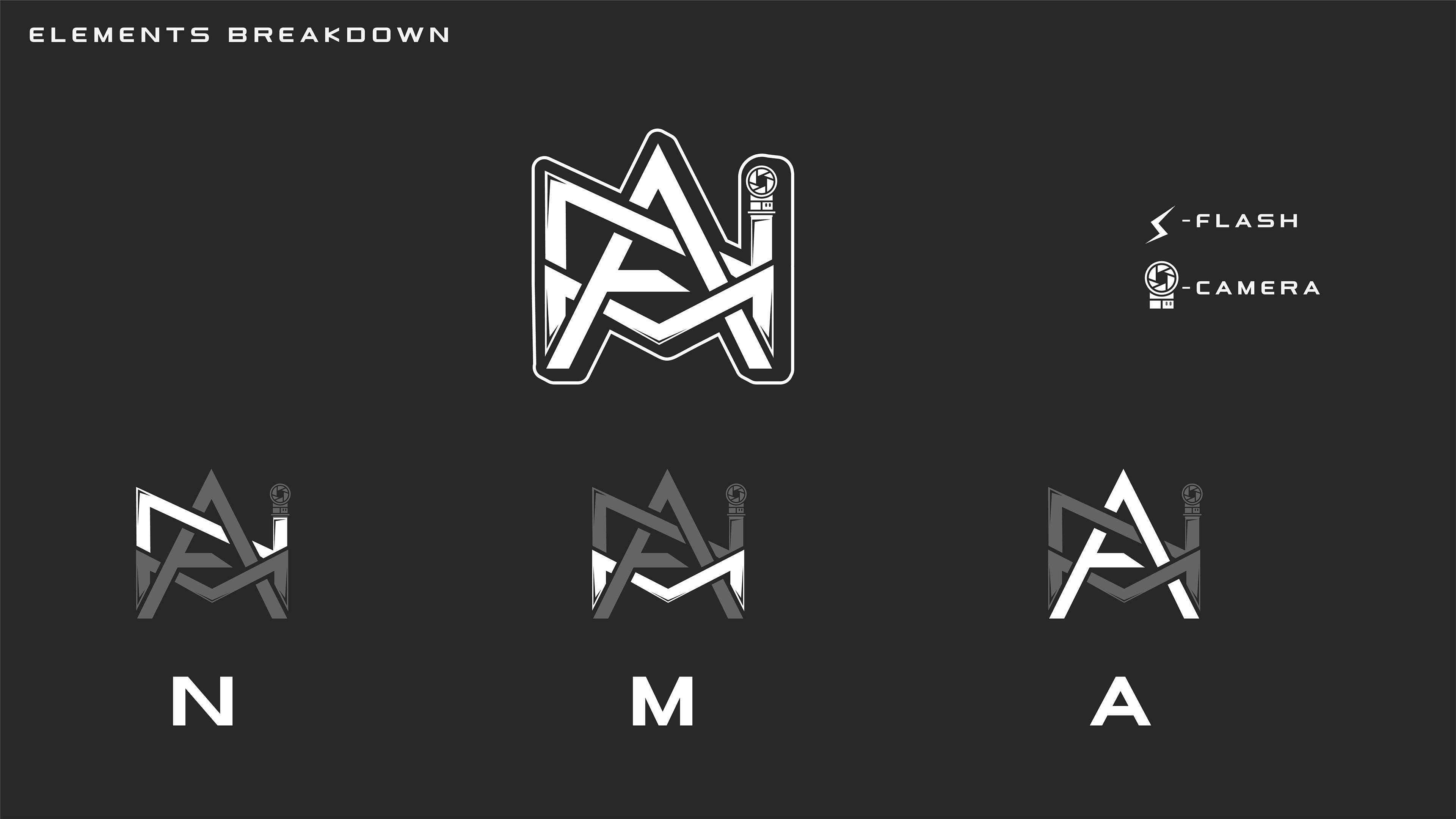
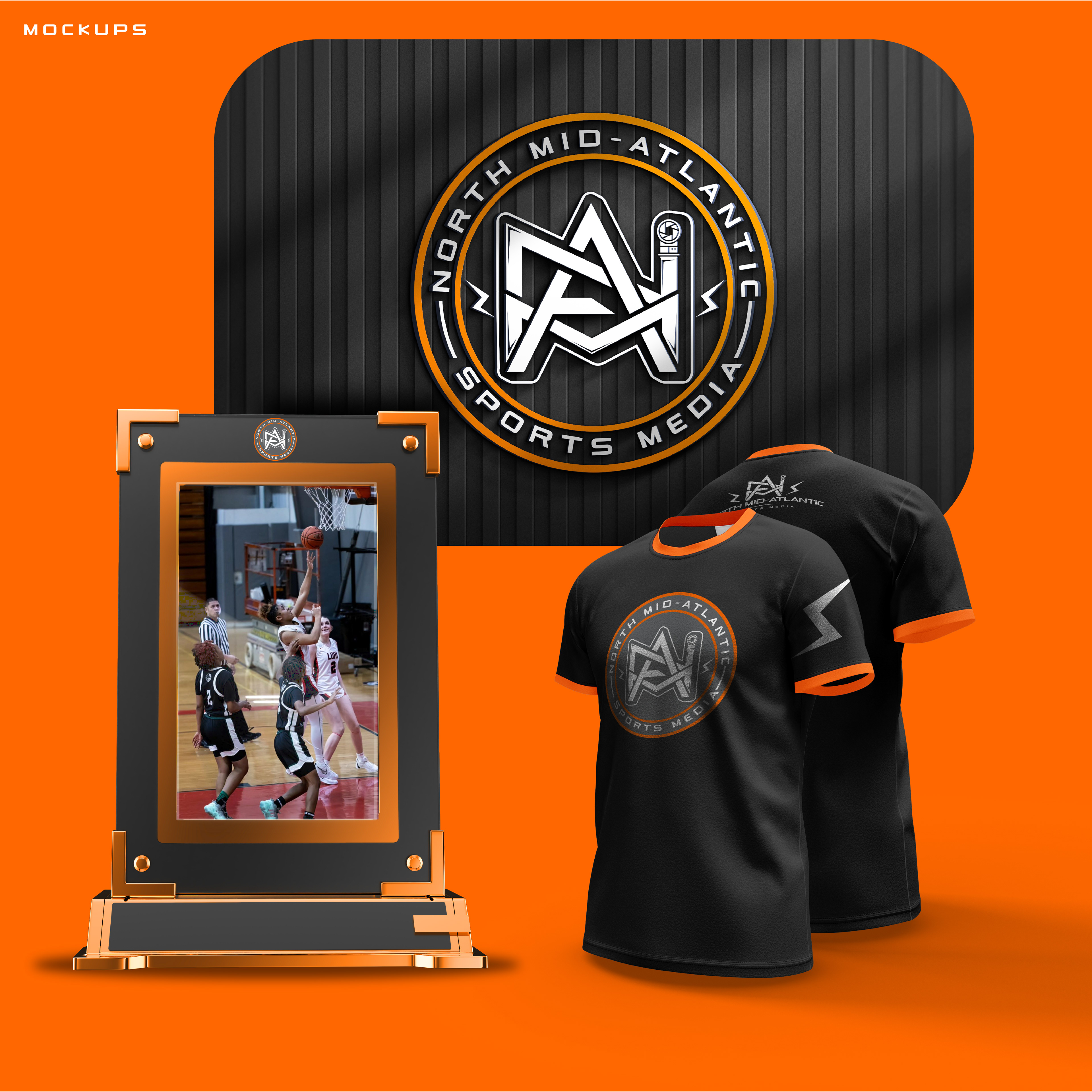
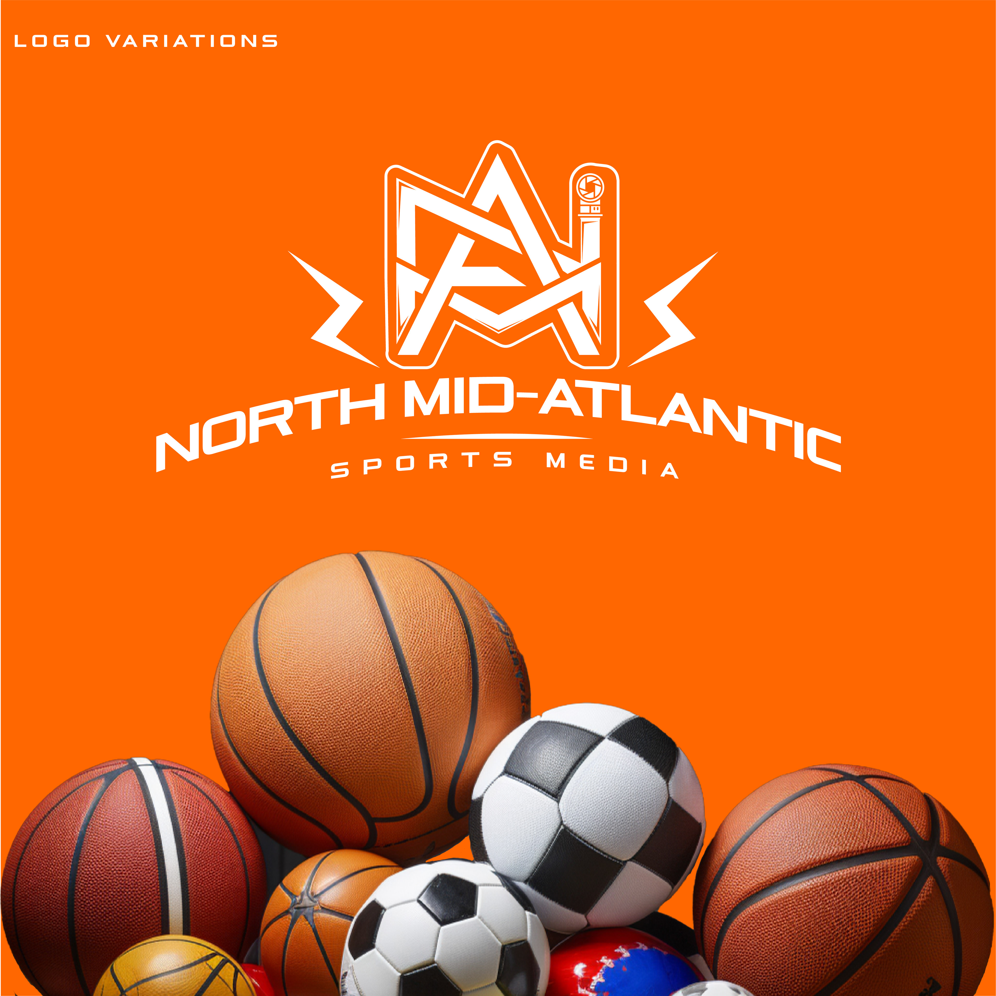
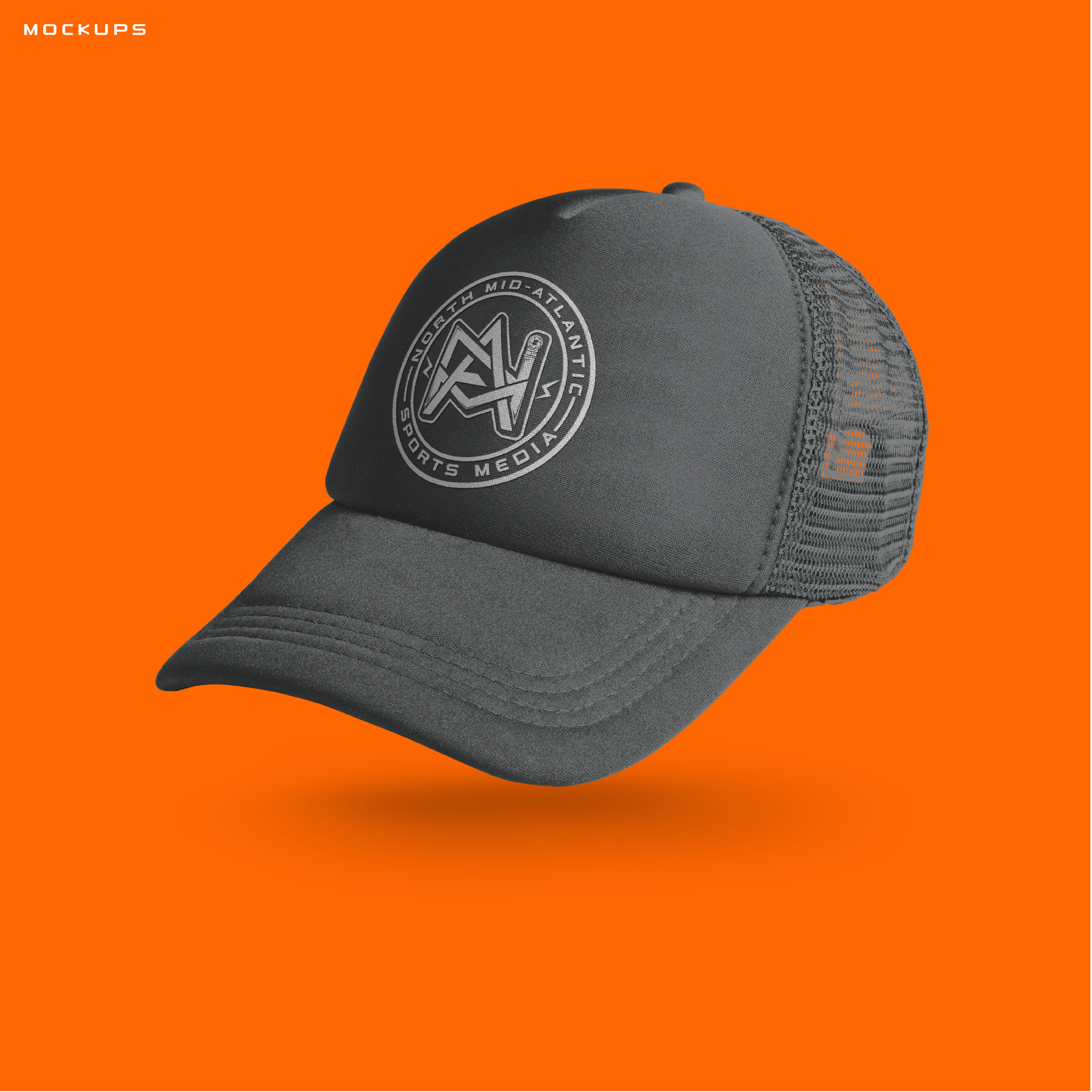
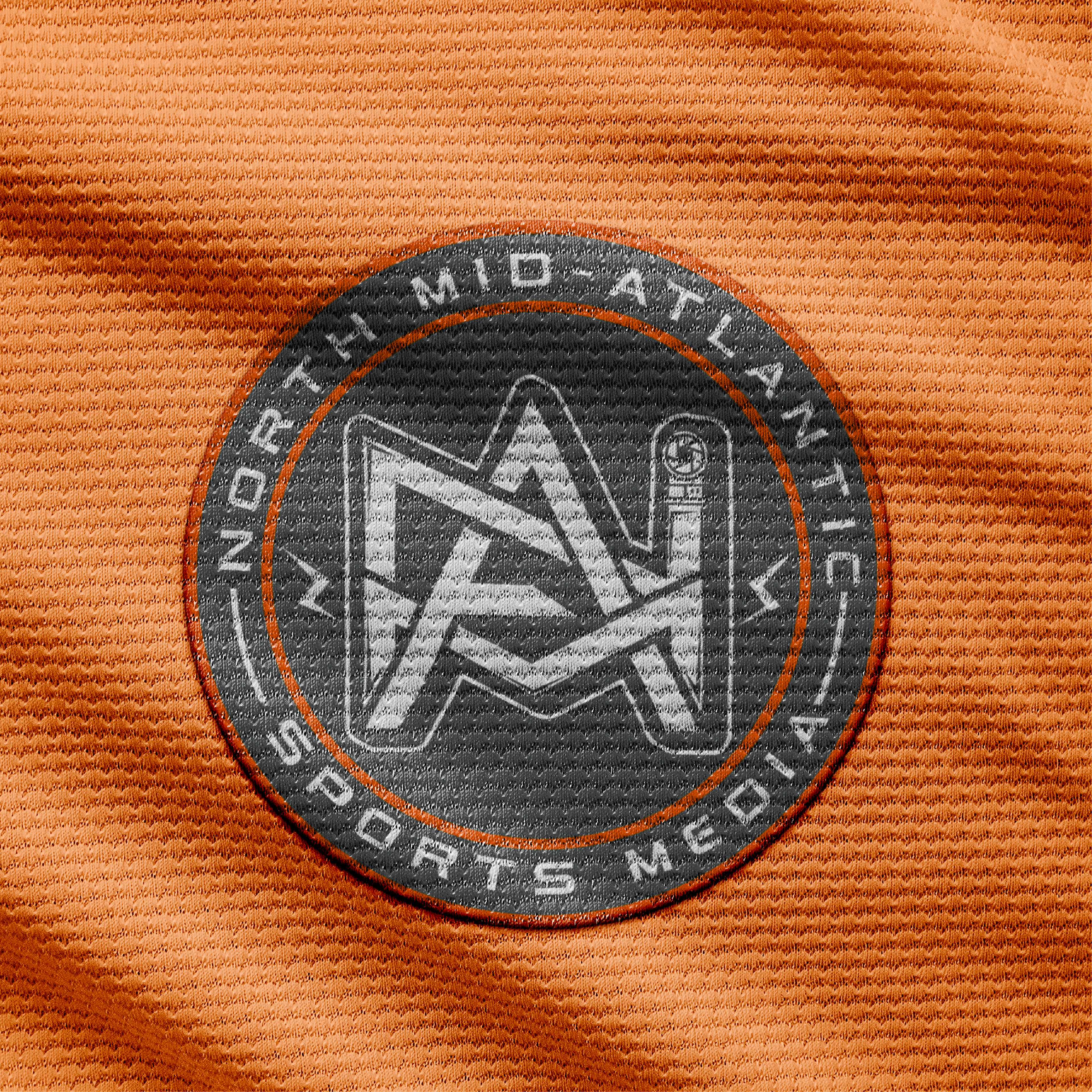
The North Mid-Atlantic Sports Media logo features bold, intertwined "NMA" letters and a camera with a flash icon, representing dynamic sports coverage and timely reporting. The vibrant orange and gray scheme ensures it stands out in any setting, while its modular design highlights its versatility and adaptability. Applied to merchandise and digital branding, the logo connects with fans and adapts to various media, from social platforms to broadcasting sets, with a pattern design for larger applications.
THE DIVAS DEN
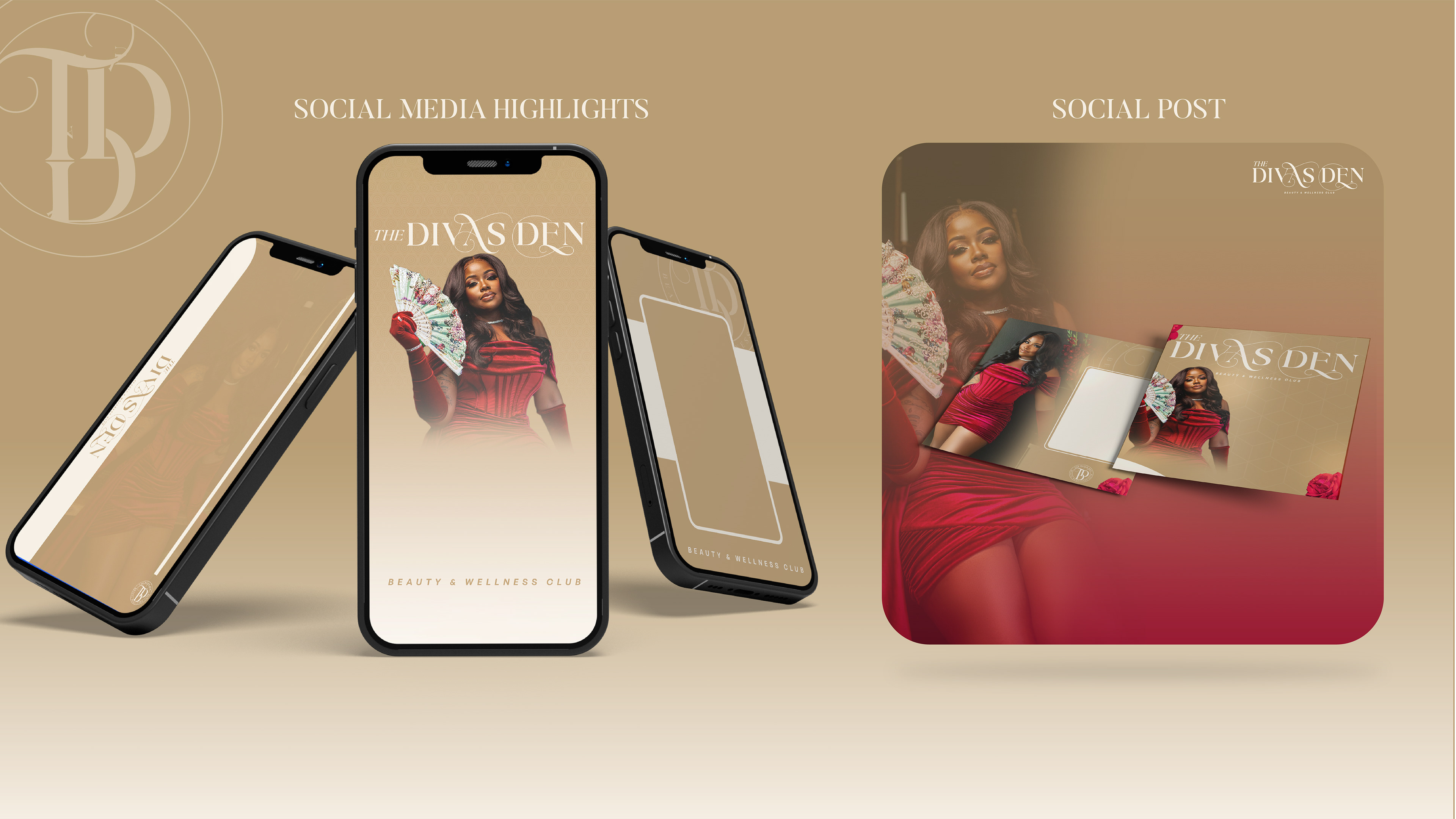
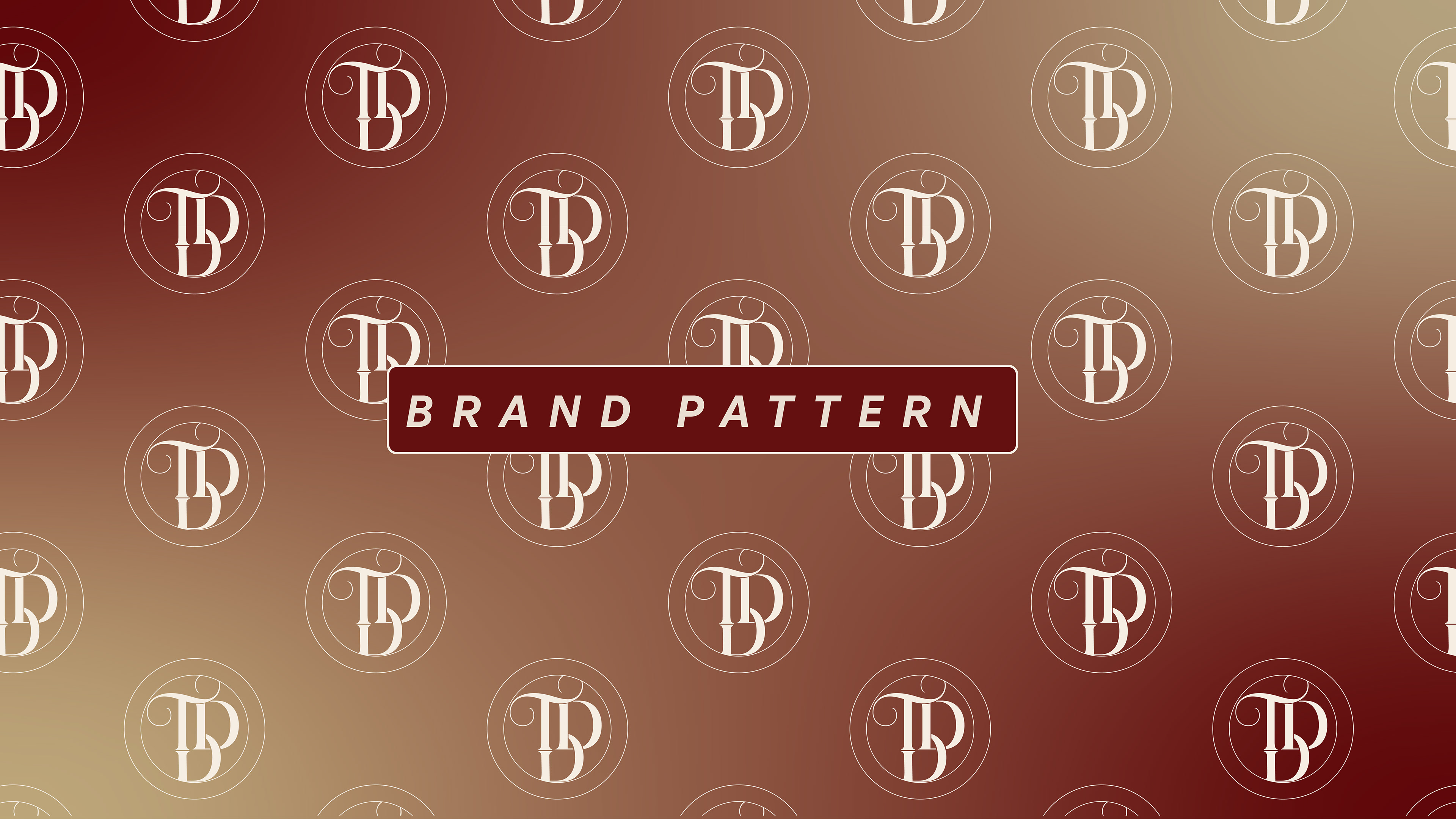
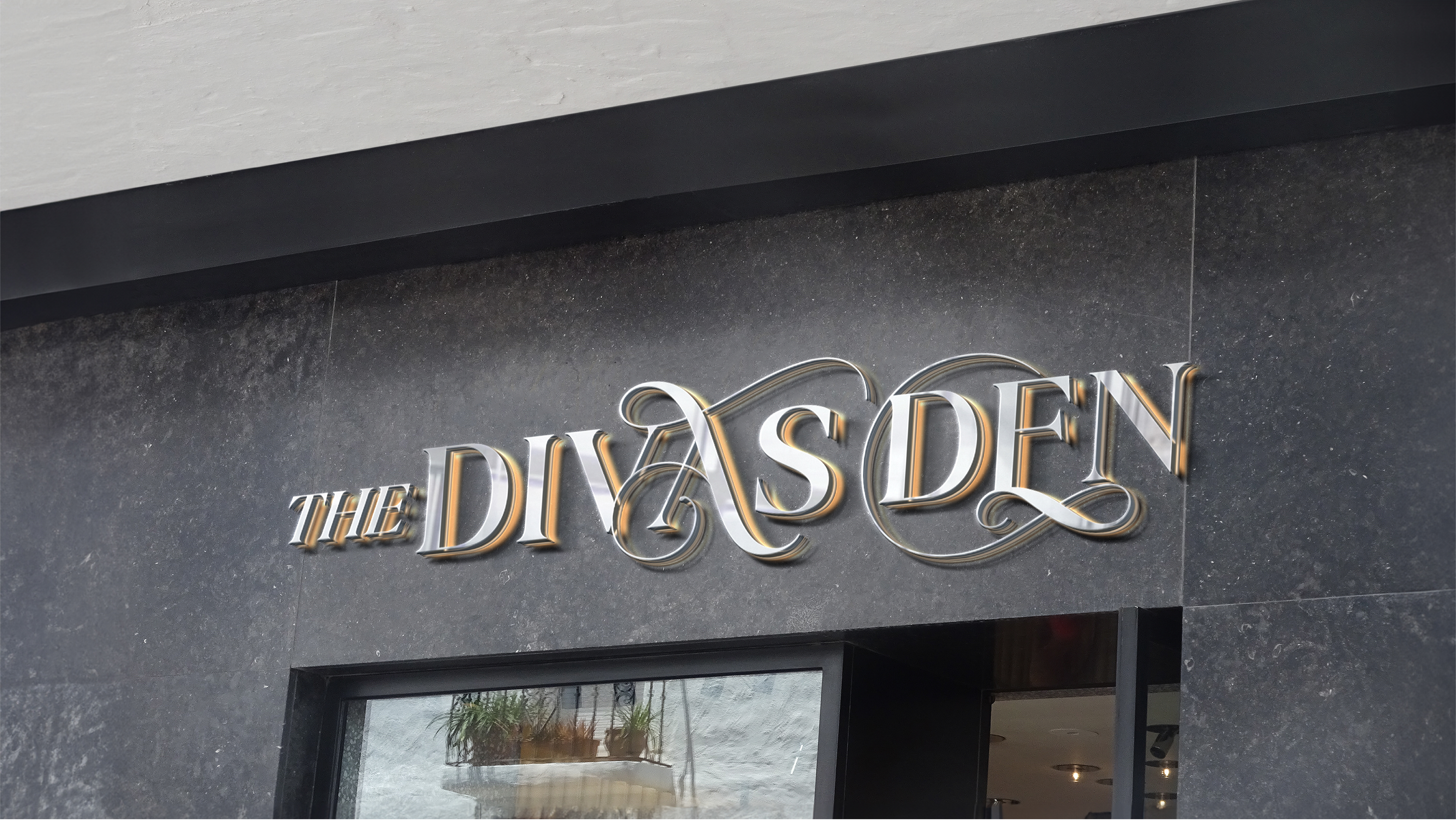
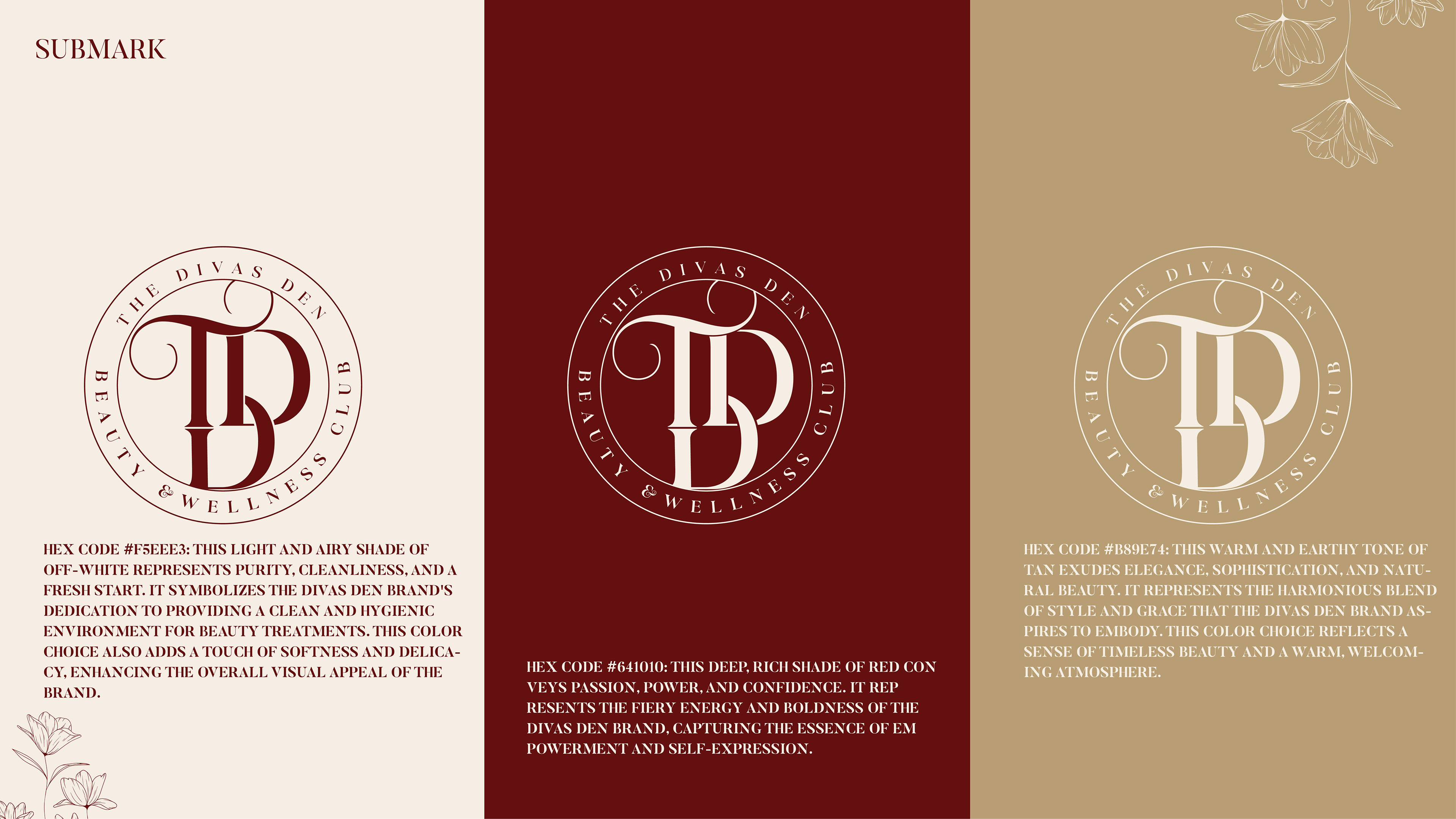
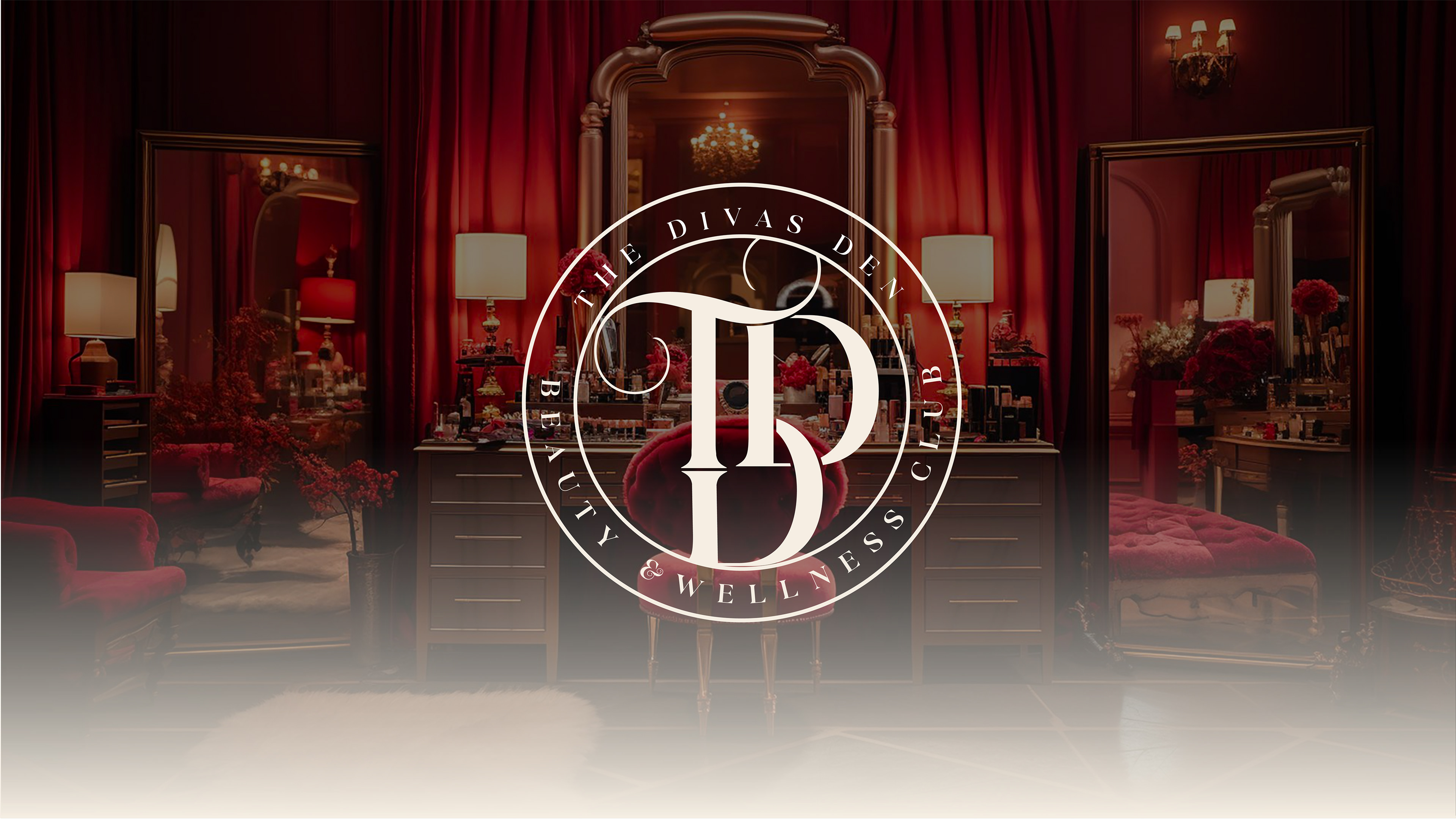
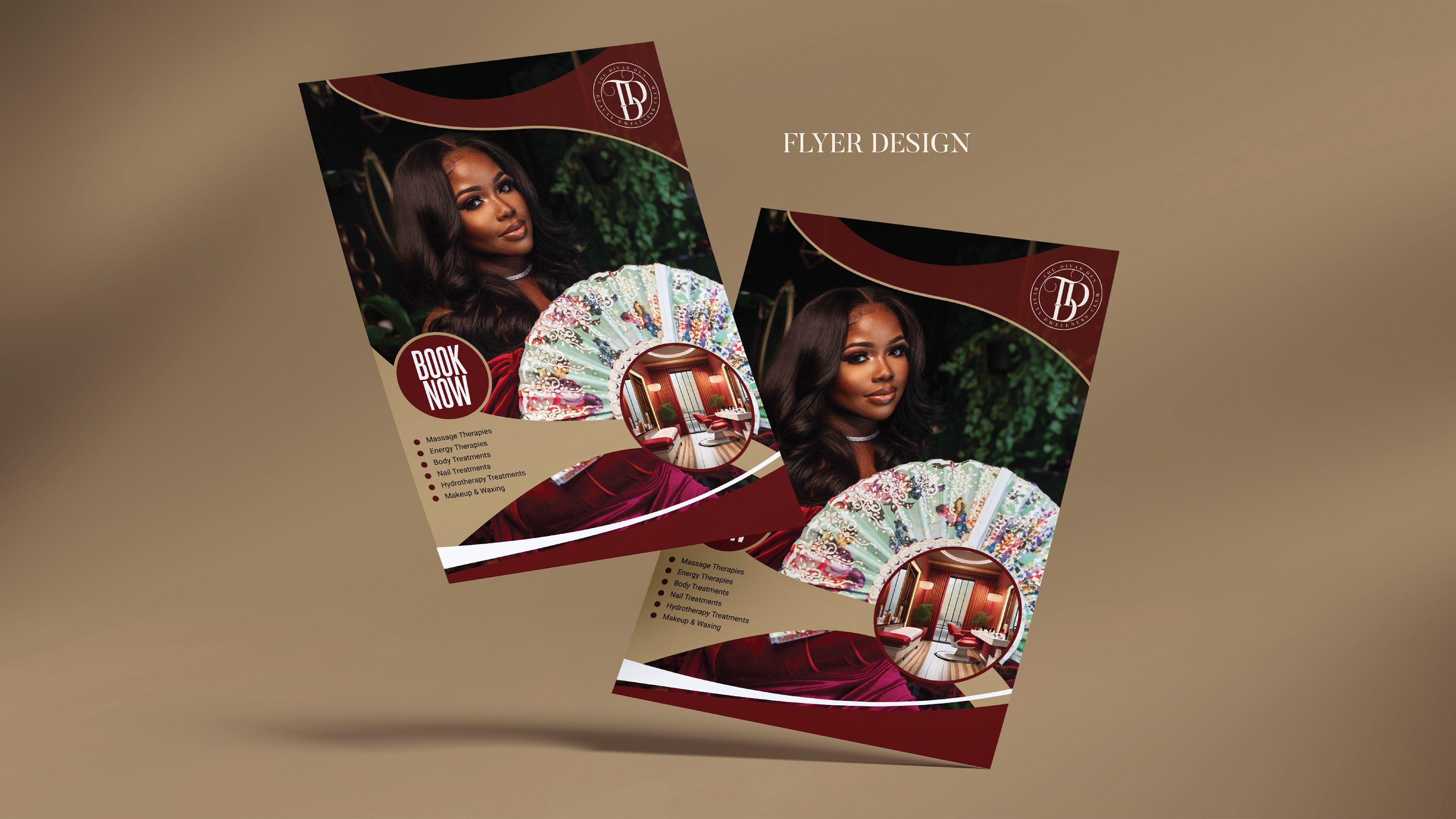
I designed The Divas Den logo to embody elegance and fluidity, reflecting the luxurious essence of the beauty and wellness club. The interlocking 'TDD' monogram symbolizes the brand's holistic approach to beauty and wellness. The color palette combines soft beige for purity with deep red for passion, creating a warm, welcoming atmosphere. The brand pattern, featuring the subtle, sophisticated monogram, enhances brand recognition across various applications. Imagery portrays clients with confidence and glamour, emphasizing the brand's aspirational and empowering mission. Social media templates and marketing materials like flyers maintain stylish, functional consistency, enhancing brand visibility and customer engagement. Signature 3D gilded signage invites customers into a luxurious setting, complemented by opulent interiors and versatile branding elements like the submark. This comprehensive branding strategy ensures The Divas Den's identity is not only seen but felt, reinforcing its commitment to beauty, empowerment, and wellness.
PAW PRINTS MARKETING
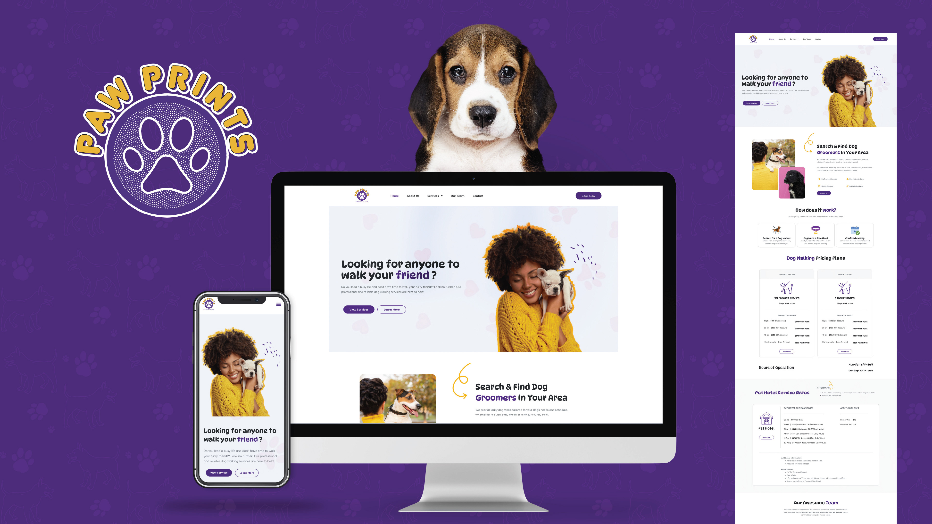
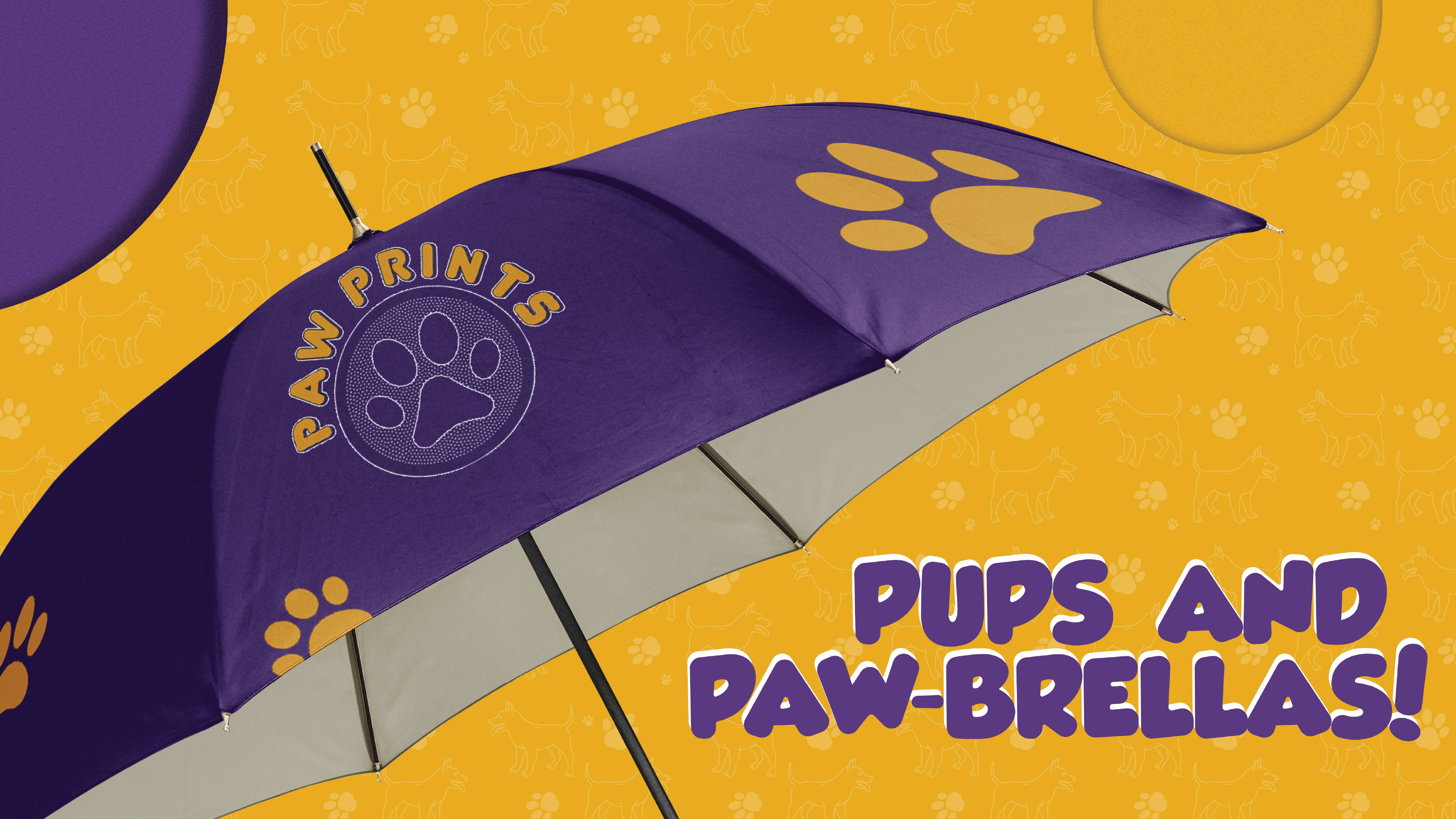
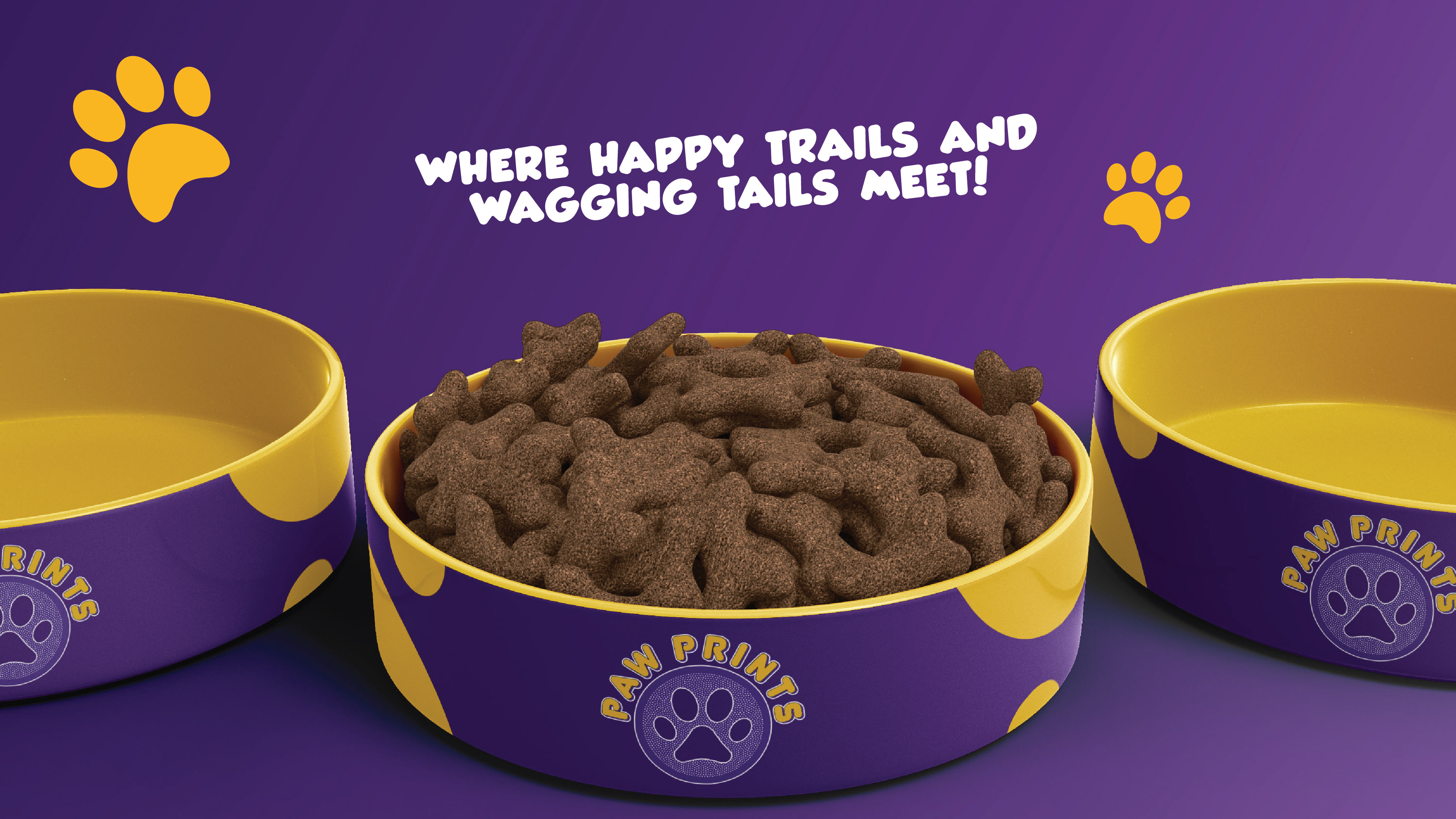
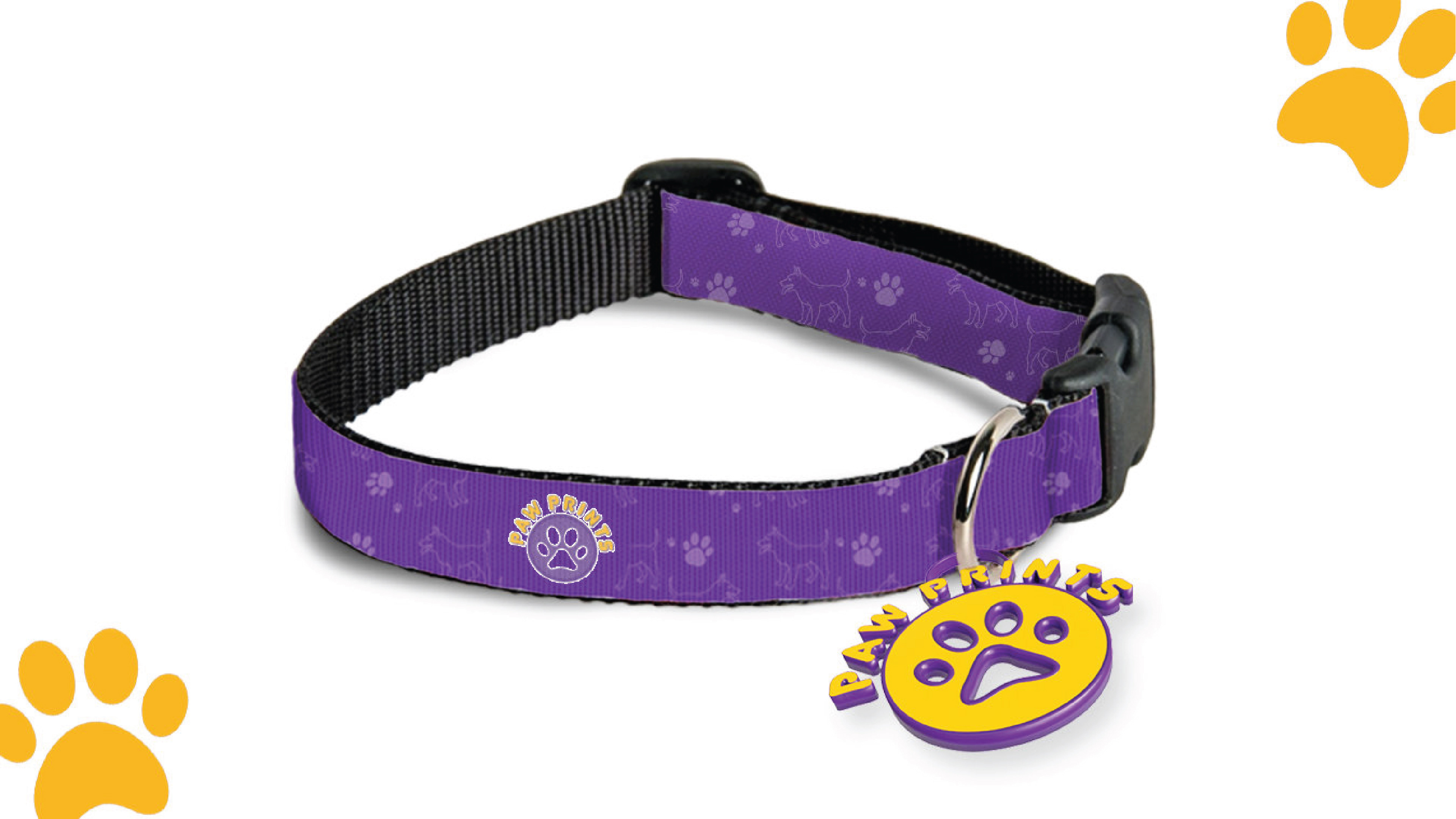
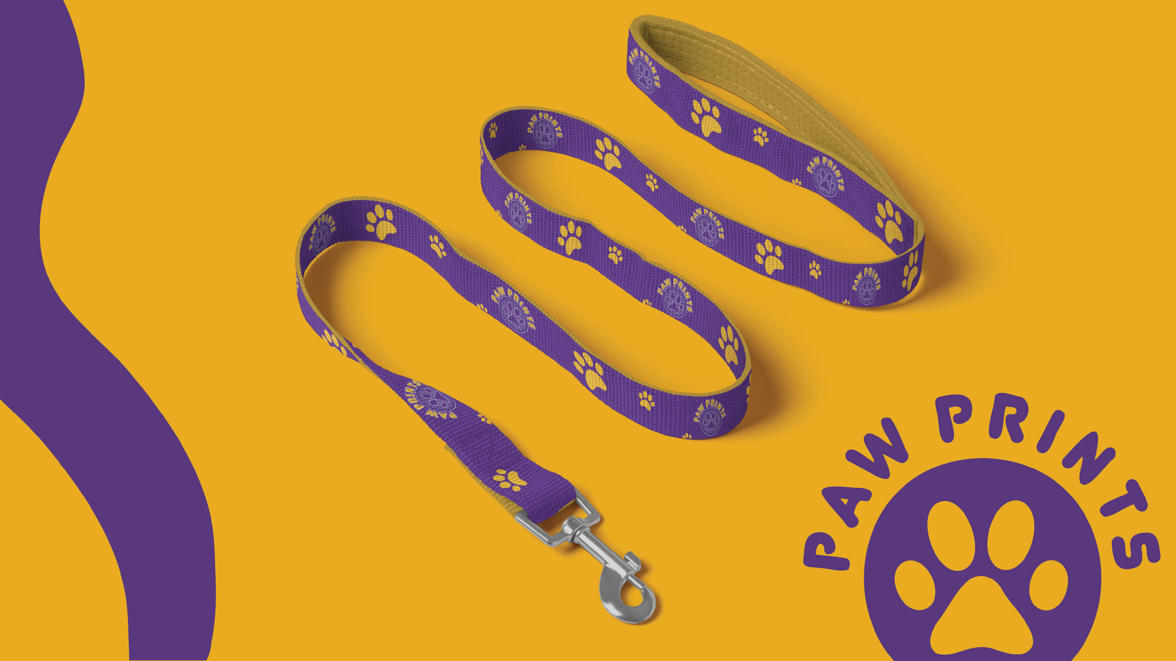
I developed a cohesive brand identity for "Paw Prints," a pet wellness company, to create a welcoming atmosphere for pet owners. The design features a clean, functional layout with a distinctive text and paw print icon, utilizing a color palette of rich purple for a regal feel, vibrant yellow for playfulness, and soft neutrals for sophistication. The typography includes a friendly sans-serif font for primary texts and a playful script for taglines. The brand voice is warm, nurturing, and lively, reflecting the bond between pets and their owners.
Identity applications include eco-friendly packaging with clear, eye-catching designs, a user-centric website for easy product discovery, and engaging social media posts that share pet care tips and celebrate customer pets. The in-store design uses soft lighting and brand colors to enhance the shopping experience, while customer service is responsive and tailored to individual needs. This strategic branding builds a lasting connection with pet owners, reinforcing their relationship with "Paw Prints."
More Logo Design Work
